Prediction analytics
After your prediction has been built and trained, you will have access to the Prediction Analytics page. This page helps you decide what users you should target based on their Churn Risk Score or category.
As soon as the prediction is done training and this page is populated, you can jump to simply using filters in segments or campaigns to begin using the outputs of the model. But, if you want help deciding who to target and why, this page can help based on the historical accuracy of the model and your own business goals.
Analytics Components
- Churn Score and Category
- Prediction Quality
- Estimated Results
- Churn Correlation Table
Overview
The distribution of the scores for the entire prediction audience is displayed at the top of the page in a chart that you can view, by category or by score. Users in bins further to the right have higher scores and are more likely to churn. Users in bins further to the left are less likely to churn. The slider beneath the chart will allow you to select a swath of users and estimate what the results would be of targeting users in the selected range of Churn Risk Score or category.
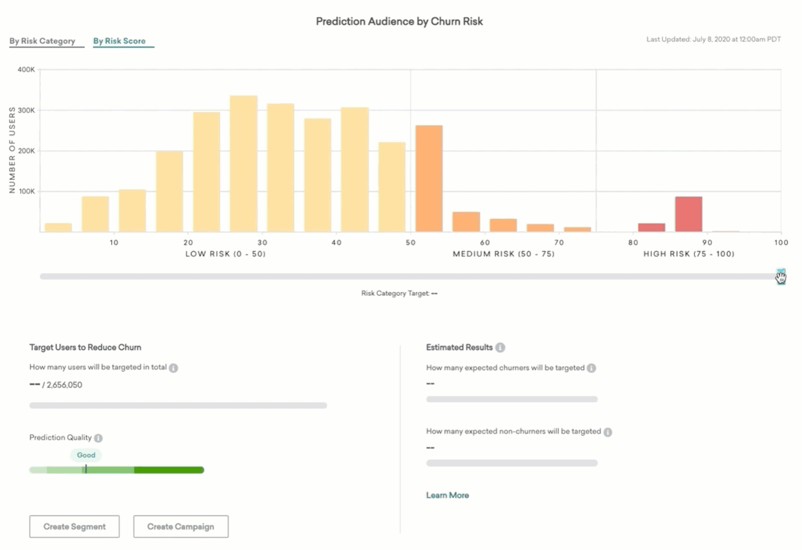
As you move the slider, the bar in the left half of the lower panel will inform you how many users out of the entire prediction audience would be targeted.
Churn score and category
Users in the prediction audience will be assigned a Churn Risk Score between 0 and 100. The higher the score, the greater the likelihood of churn.
- Users with scores between 0 and 50 will be labeled in the Low Risk category.
- Users with scores between 50 and 75, and 75 and 100 will be labeled in the Medium Risk and High Risk categories, respectively.
The scores and the corresponding categories will be updated according to the schedule you chose on the model creation page. The number of users with churn scores in each of 20 equally sized buckets is displayed in the chart at the top of the page. This can help you determine what the churn risk looks like across the population according to this prediction.
Targeting users to reduce churn
Prediction quality
To measure the accuracy of your model, the Prediction Quality metric will show you how effective this particular machine learning model appears to be when tested on historical data. Refer to Prediction Quality to learn more about the metric.
Here’s what we recommend for various ranges of Prediction Quality:
| Prediction Quality Range (%) | Recommendation |
|---|---|
| 60 - 100 | Excellent. Top tier accuracy. Changing the audience definitions is unlikely to provide additional benefit. |
| 40 - 60 | Good. This model will produce accurate predictions, but trying different audience settings may achieve even better results. |
| 20 - 40 | Fair. This model can provide accuracy and value, but consider trying different audience definitions to see if they increase performance. |
| 0 - 20 | Poor. We recommend you change your audience definitions and try again. |
The prediction will be trained again every two weeks and updated alongside the prediction quality metric to keep your predictions updated on the most recent user behavior patterns. The last time this retraining occurred will be displayed on the predictions list page as well as on your prediction’s analytics page.
Estimated results
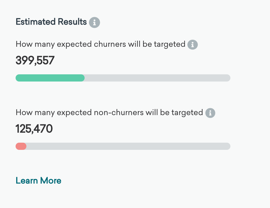
In the right half of the panel beneath the chart, we show estimates of the expected accuracy of targeting this swath of the prediction audience. Based on data about users in the prediction audience in the past, and the apparent accuracy for the model for discriminating between churning and non-churning users on that past data, these progress bars estimate for a future potential message using the audience highlighted with the slider:
-
An estimate of how many actual churners will be correctly targeted
Of course, we don’t know the future perfectly, so we don’t know precisely which users from the prediction audience will churn in the future. But the prediction is a reliable inference. Based on past performance, this progress bar indicates how many of the total “actual” or “true” churners expected in the prediction Audience (based on prior churn rates) will be targeted with the current targeting selection. We would expect this number of users to churn if you do not target them with any extra or unusual messaging. -
An estimate of how many users who wouldn’t have actually churned will be incorrectly targeted
All machine learning models make errors. There may be users in your selection who have a high Churn Risk Score but do not end up churning. They would not churn even if you took no action. They will be targeted anyway, so this is an error or “false positive.” The full width of this second progress bar represents the expected number of users who will not churn, and the filled portion is those who will be incorrectly targeted using the current slider position.
Using this information, we encourage you to decide how many of the churners you want to capture and what the cost of a false positive error is for your business. If you are sending out a valuable promo, you may want to keep non-churners targeted to a minimum while getting as many expected true churners as the model will allow. Or, if you’re less sensitive to false positives and users receive extra messaging, you can message more of the audience to capture more expected churners and ignore the likely errors.
Churn correlation table
This analysis displays any user attributes or behaviors that are correlated with user churn in the historical prediction audience. The tables are split into left and right for more and less likely to churn, respectively. For each row, the ratio by which the users with the behavior or attribute in the left column are more or less likely to churn is displayed in the right column. This number is the ratio of churn likelihood of users with this behavior or attribute divided by the likelihood to churn off the entire prediction audience.
This table is updated only when the prediction retrains and not when user Churn Risk Scores are updated.
Correlation data for preview predictions will be partially hidden. A purchase is required to reveal this information. Contact your account manager for more information.
 Edit this page on GitHub