Creative details for Content Cards
Customizing Content Cards and the feed they are located in can’t be done during the campaign creation process—you must work with your engineers and developers to build and customize your cards. For technical details, visit our developer documentation.
Content Card types
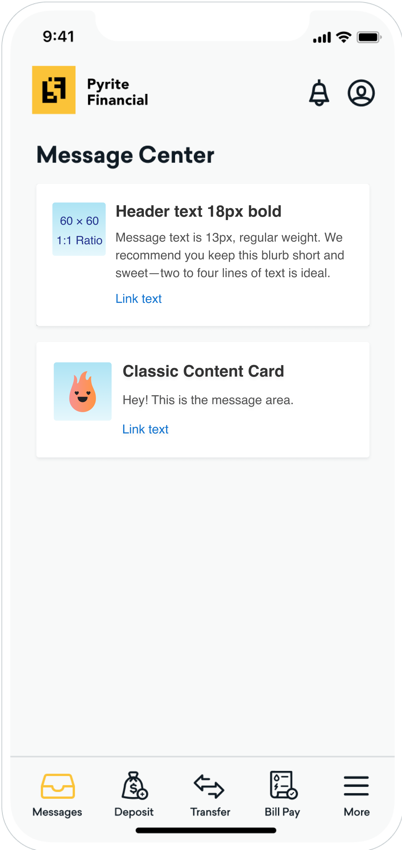
The classic card is great for standard messaging and notifications or even visually categorizing messages with icons. The image is optional, but it must be at a 1:1 ratio.
| Card Capability | Details |
|---|---|
| Header Text | 18px; Bolded One line of text is ideal. You may use Liquid here to personalize your message. |
| Message Text | 13px; Regular Weight Two to four lines of text is ideal. You may use Liquid here to personalize your message. |
| Link Text | Optional. 13 px Link to web page or deep link to within your app. |
| Image | Optional. Must be 1:1 ratio. We recommend an image quality of 60 x 60 px. |
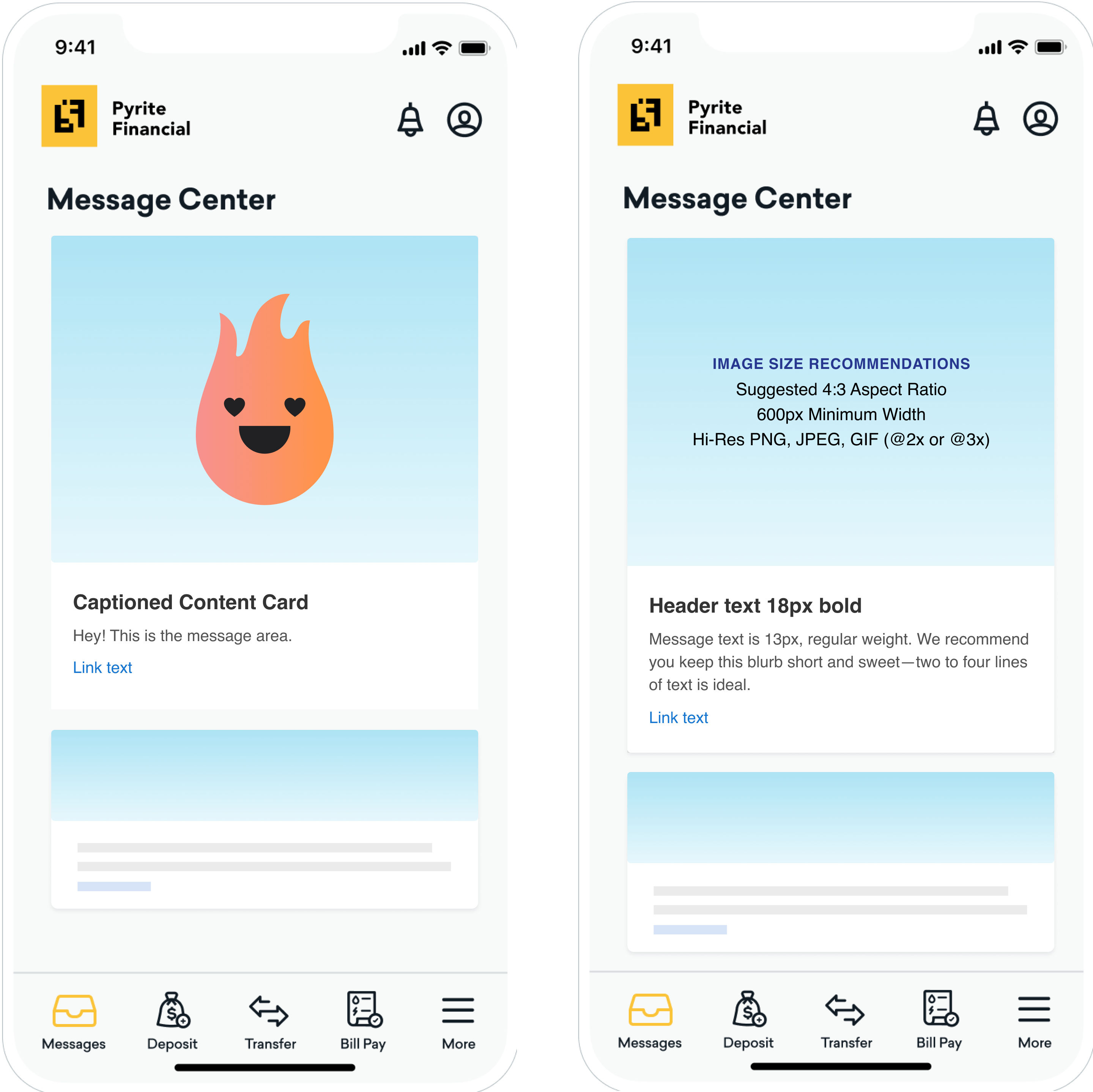
The Captioned Image card is a great way to show off and attract attention to important content, like a big sale or a new app feature.
| Card Capability | Details |
|---|---|
| Header Text | 18px; Bolded One line of text is ideal. You may use Liquid here to personalize your message. |
| Message Text | 13px; Regular Weight Two to four lines of text is ideal. You may use Liquid here to personalize your message. |
| Link Text | Optional. 13 px Link to web page or deep link to within your app. |
| Image | Suggested be 4:3 ratio. 600 px minimum width. Supports high-resolution PNG, JPEG, and GIF. |
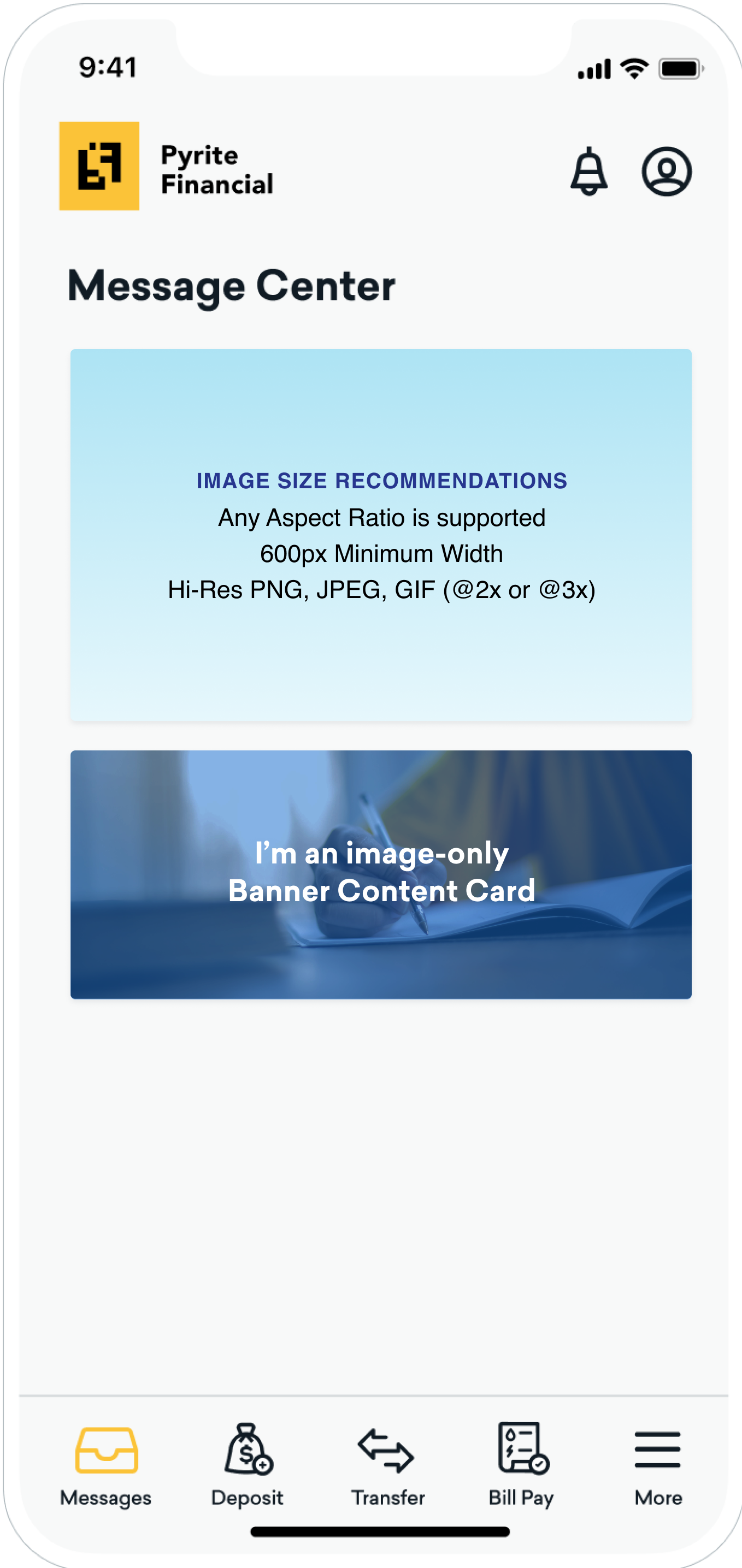
If you want fancy, the banner card is for you. This is completely customized to what you want it to be. Just create your content elsewhere and upload it for a beautiful card that’s all your own.
| Card Capability | Details |
|---|---|
| Linked Card | Optional. 13 px On-click behavior link to a web page or a deep link to within your app. |
| Image | Any aspect ratio supported. 600 px minimum width. Supports high-resolution PNG, JPEG, and GIF. |
Global creative details
Content Cards come with great functionality from the very beginning. At this time, card styling cannot be done natively in your Braze account, but you can style your Content Card by type and the Content Card feed during integration. Refer to Customizing Content Cards for more information.
Dismissal behavior
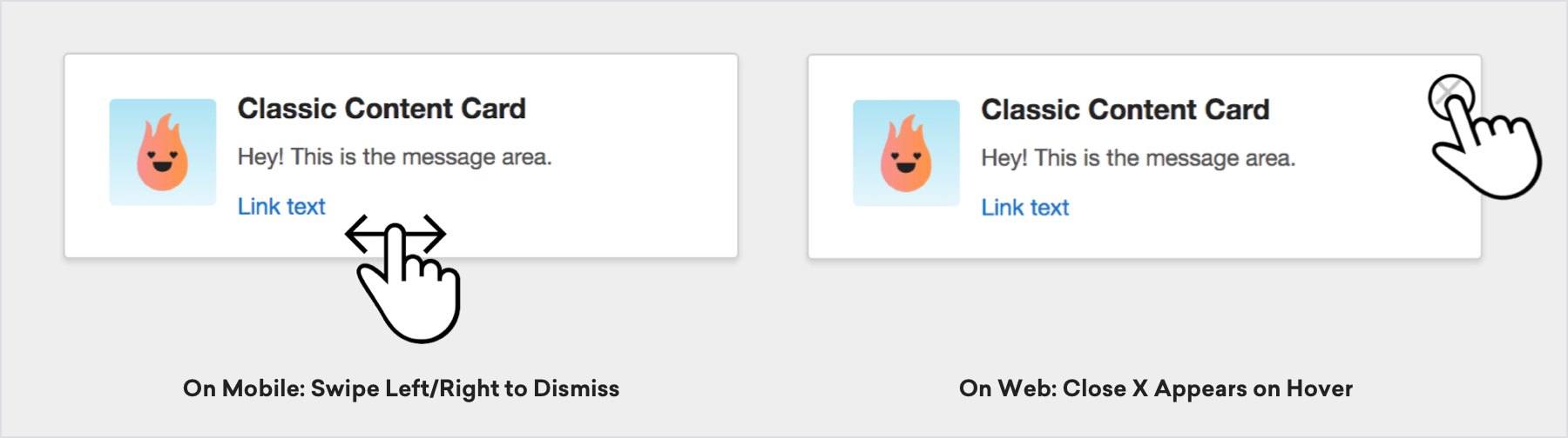
For a user to dismiss a card, they can either swipe it away on mobile, or use a close X function, as shown in the following screenshot. The x will appear on hover for the Web SDK only.
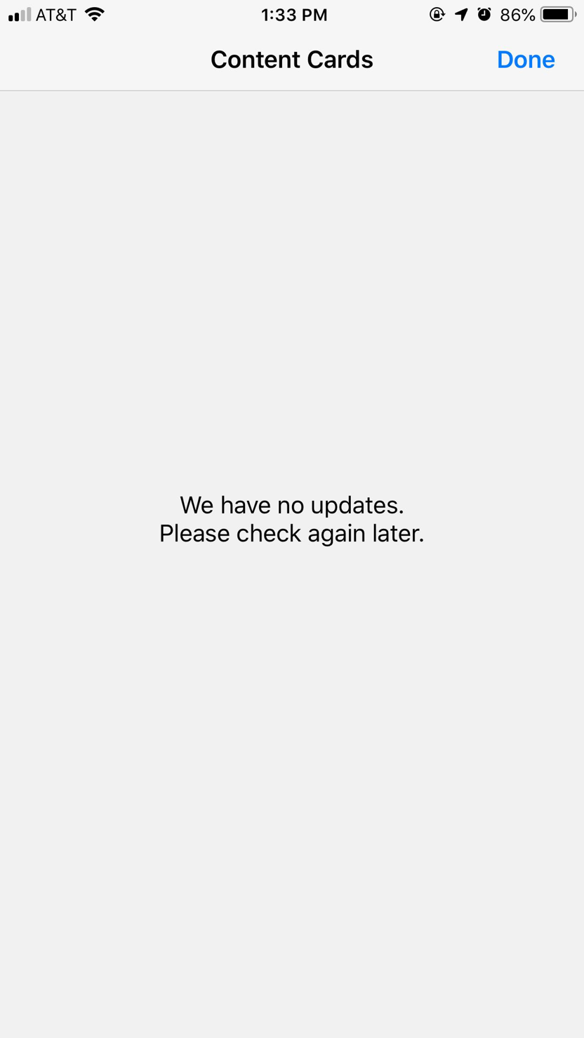
If a user has dismissed all of their cards or you haven’t pushed out any new updates, the user’s feed will usually look something like this:
Keep Content Cards relevant by setting them to dismiss when a user takes relevant actions. For example, set promotional Content Cards to be dismissed as soon as users make a purchase so they don’t continue to see an offer for something they already bought.
Using GIFs in Content Cards
| Content Cards for Android | Content Cards for iOS | Content Cards for Web |
|---|---|---|
| The Android SDK does not provide animated GIF support by default. For more details on activating GIF support, refer to GIFs. | The Swift SDK does not provide animated GIF support by default. For more details on activating GIF support, refer to the GIF support tutorial. | GIF support is included by default in the Web SDK integration. |
 Edit this page on GitHub