Email reporting
This article covers the different components of your email reporting and where it can be found in the dashboard.
Viewing analytics
Once you’ve launched your campaign, you can return to the details page for that campaign to view key metrics. Navigate to the Campaigns page and select your campaign to open the details page. For email sent in Canvas, refer to Canvas analytics.
Looking for definitions for the terms and metrics listed in your report? Refer to our Email Analytics Glossary
From the Campaign Analytics tab, you can view your reports in a series of panels. You may see more or less than those listed in the sections below, but each has its own useful purpose.
Time range
By default, the time range for Campaign Analytics will display the last 90 days from the current time. This means that if the campaign was launched more than 90 days ago, the analytics will display as “0” for the given time range. To view all analytics for older campaigns, adjust the reporting time range.
Campaign details
The Campaign Details panel shows a high-level overview of the entire performance for your email.
Review this panel to see overall metrics such as the number of messages sent to the number of recipients, the primary conversion rate, and the total revenue generated by this message. You can also review delivery, audience, and conversion settings from this page.

Changes Since Last Viewed
The number of updates to the campaign from other members of your team is tracked by the Changes Since Last Viewed metric on the campaign overview page. Select Changes Since Last Viewed to view a changelog of updates to the campaign’s name, schedule, tags, message, audience, approval status, or team access configuration. For each update, you can see who performed the update and when. You can use this changelog to audit changes to your campaign.
Email Performance
The Email Performance panel outlines how well your message has performed across various dimensions. The metrics in this panel vary depending on your chosen messaging channel, and whether or not you are running a multivariate test. You can click on the Preview icon to view your message for each variant or channel.
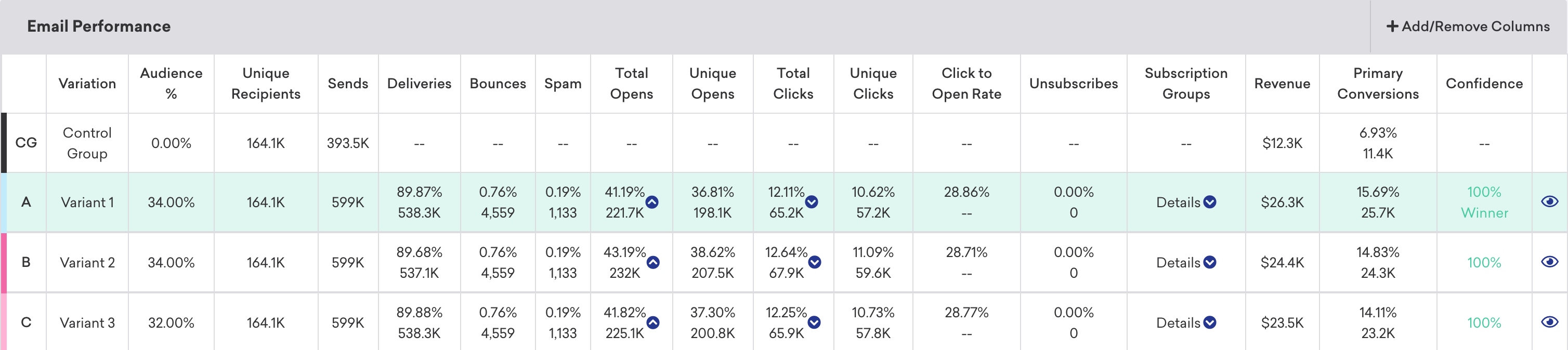
If you want to simplify your view, click Add/Remove Columns and clear any metrics as desired. By default, all metrics are displayed.
Heatmaps
Using heatmaps, you can see how successful different links in a single email campaign. From the Message Analytics section, go to the Email Performance panel. Select Preview & Heatmap to view a preview of your email campaign and the heatmap. Alternatively, you can select the hyperlink in the variant name to view the heatmap.
In this view, you can use the Show Heatmap toggle to bring up a visual view of your email that shows the overall frequency and location of clicks within the lifespan of the campaign. In the Link Table by Total Clicks panel, you can view all of the links in your email campaign and sort by total clicks. This can provide additional insight on where your users navigate. To save a copy of the heatmap for reference, select the download button.

Images
We recommend enabling CORS for your image URLs to help prevent images from breaking in heatmap previews and exports.
If images are missing from an export, work with your developers so image assets allow cross-origin access: the server should return the Access-Control-Allow-Origin header with either * or your Braze dashboard domain.
Email metrics
Here are some key email-specific metrics that you won’t see in other channels. To see the full definitions of all email metrics used in Braze, refer to our Email Analytics Glossary.
| Metric | Definition |
|---|---|
| Unique Clicks | Unique Clicks is the distinct number of recipients who have clicked a link within a message at least once and is measured by dispatch_id. This is tracked over a seven-day period for email and measured by dispatch_id. This includes clicks on Braze-provided unsubscribe links. This number should be between 5–10%. Anything greater than 10% is exceptional! |
| Unique Opens | Unique Opens is the total number of delivered messages that have been opened by a single user at least once and are tracked over a seven-day period. For email, this is tracked over a 7 day period. This number should be between 30–40%. Anything greater than 40% is exceptional! |
| Click-to-Open Rate | Click-to-Open Rate is the percentage of opened emails that have been clicked by a single user or machine at least once, and is only available in the Report Builder. |
| Spam Rate | Spam is the total number of emails delivered that were marked as "spam" by the recipient. While Braze doesn't change the subscription state of these users, these users will be automatically excluded in future emails, unless you're sending a transactional email, which is configured to "send to all users including unsubscribe". If this metric is greater than 0.08, that could be a sign that either your message copy is too salesy, or you should reconsider your email address collection methods (to confirm you're messaging those who are interested in your correspondence). |
| Unsubscribers or Unsub | Unsubscribers or Unsub is the number of messages resulting in an unsubscription. Unsubscriptions occur when a user clicks on the Braze unsubscribe link. |
| Other Opens | Other Opens includes emails that haven't been identified as Machine Opens. For example, when a user opens an email on another platform (such as Gmail app on a phone, Gmail on desktop browser), this will be logged as an Other Opens. |
| Estimated Real Opens | Estimated Real Opens is an estimate of how many unique opens there would be if machine opens did not exist, and is the result of a proprietary Braze statistical model. See the following section for details. |
| Machine Opens | Machine Opens includes the proportion of "opens" that are affected by Apple's Mail Privacy Protection (MPP) for iOS 15. For example, if a user opens an email using the Mail app on an Apple device, this will be logged as a Machine Opens. |
| Bounces | Bounces is the total number of messages that were unsuccessfully delivered to the intended recipients. |
| Hard Bounce | A Hard Bounce is when an email fails to deliver to the recipient due to a permanent delivery error. A hard bounce might occur because the domain name doesn't exist or because the recipient is unknown. |
| Soft Bounce | A Soft Bounce is when an email fails to deliver to the recipient due to a temporary delivery error, even though the recipient’s email address is valid. A soft bounce might occur because the recipient's inbox is full, the server was down, or the message was too large for the recipient's inbox. |
| Deferral | A Deferral is when an email was not immediately delivered, but Braze retries the email for up to 72 hours after this temporary delivery failure to maximize the chances of successful delivery before attempts for that specific campaign are stopped. |
Deliveries and bounces
The dashboard highlights Hard Bounces. Some Bounces may be soft bounces and won’t match that count alone. You can approximate soft bounces with this formula:
Sends − (Deliveries + Hard Bounces) ≈ Soft Bounces
Deliveries can rise during the first 72 hours as retries succeed, while Sends and hard bounces for a one-time send stay fixed once the send completes.
Clicks without an open event
A click can be logged without an open when the open pixel never loads. For example, the message is clipped in Gmail, or the user has disabled images (the open pixel is usually at the footer). Some clients proxy images (such as Apple Mail), so the open may log when the server first fetches the pixel, not when the user reads the mail. Corporate domains often block images by default.
A click and open can also land on different days: a user might click on May 16 with images off (no open), then open in webmail on May 17 (open logged then).
Deferrals
Deferred or deferral is when an email was not immediately delivered, but Braze will retry the email for up to 72 hours after this temporary delivery failure to maximize the chances of successful delivery before attempts for that specific campaign are stopped. Typical reasons for deferrals include reputation-based email volume rate-limiting from the inbox provider, temporary connectivity issues, or DNS errors.
Deferrals differ from Soft Bounces. If no email was successfully delivered during this retry period, Braze will send one soft bounce event per attempted campaign sent. Before February 25, 2025, these retries were counted as multiple soft bounces for 1 campaign send.
Note that Deferrals are currently only available using Currents or Braze Snowflake features (such as Query Builder, SQL Segment, Snowflake Data Sharing). If you’d like to include this in campaign or Canvas analytics, please submit product feedback.
Estimated real open rate
This statistic uses a proprietary analytical model created by Braze to reconstruct an estimate of the campaign’s unique open rate as if machine opens did not exist. While we receive labels of Machine Opens on some open events from email senders (see above), these labels can often label actual opens as machine opens. In other words, the Other Opens are likely an underestimate of real opens (by actual users). Instead, Braze uses click data from each campaign to infer the rate at which actual humans opened the message. This compensates for various machine opening mechanisms, including Apple’s MPP.
Estimated Real Open Rate is calculated 36 hours after email sending has begun and is recalculated every 24 hours thereafter. If a campaign recurs, the estimate is recalculated 36 hours after another send occurs.
Because this metric is recalculated on an ongoing cadence, the Estimated Real Open Rate value can change over time as new engagement signals (such as opens and clicks) are received and incorporated into the model. In practice, the Estimated Real Open Rate can continue to update daily while a campaign remains active.
Typically around 10,000 delivered emails are required for the statistic to be computed successfully, though that number can vary depending on click rate. If the statistic can’t be computed, then the column displays “–”.
Limitations
Estimated Real Open Rate is only available in campaigns, and is not reported in Current events. This metric is only retroactively calculated for active campaigns launched before November 14, 2023.
Handling increases in click rates
Open rates can be an insightful metric to track for your email campaigns. However, these open rates aren’t necessarily accurate indicators of human engagement with email campaigns. An open event, by definition, occurs when a user opens an email, meaning a transparent open tracking pixel was successfully downloaded.
Additionally, use of security scanning tools can inflate open rates. Some of these tools protect their users by scanning incoming emails for malicious content by clicking links to verify their legitimacy. These clicks are often referred to as “bot clicks” or “non-human interaction” (NHI).
Ultimately, after an email leaves our servers, we have limited visibility into what happens next, but here are recommendations for managing NHI affecting your results:
- Be aware that this can happen to any sender and nearly any recipient. Clicks, like opens, are not entirely reliable indicators of human interaction with your messages, meaning NHI is not preventable.
- Higher positive engagement tends to correlate with lower NHI, so it’s important to follow email messaging best practices. This includes getting explicit permission from your users to send email and sunsetting unengaged subscribers on a regular cadence.
- Use HTTPS links in your emails when possible. NHI is less common for senders using secure links.
- If you use a single-click unsubscribe process, consider creating a preference center that takes users to a page to edit and manage their notification preferences. This can be helpful because NHI can inadvertently unsubscribe users.
- Consider using other metrics to measure your email marketing success, such as conversions, app sessions, or site visits.
- Add a hidden link in your email campaigns. This link would be something that a human wouldn’t notice like white-on-white text or a punctuation mark. Bots tend to click all links, so you can conclude that users generating click events on the invisible link are actually the result of NHI, so the open or click doesn’t necessarily indicate positive engagement.
Historical performance
The Historical Performance panel allows you to view the metrics from the Message Performance panel as a graph over time. Use the filters at the top of the panel to modify the stats and channels shown in the graph. The time range of this graph will always mirror the time range specified at the top of the page.
To get a day-by-day breakdown, click the hamburger menu and select Download CSV to receive a CSV export of the report.

Conversion event details
The Conversion Event Details panel shows you the performance of your conversion events for your campaign. For more information, refer to Conversion Events.

Conversion correlation
The Conversion Correlation panel gives you insight into what user attributes and behaviors help or hurt the outcomes you set for campaigns. For more information, refer to Conversion correlation.

Retention report
Retention reports show you the rates at which your users have performed a selected retention event over time periods in a specific campaign or Canvas. For more information, refer to Retention reports.
Funnel report
Funnel reporting offers a visual report that allows you to analyze the journeys your customers take after receiving a campaign or Canvas. If your campaign or Canvas uses a control group or multiple variants, you will be able to understand how the different variants have impacted the conversion funnel at a more granular level and optimize based on this data.
For more information, refer to Funnel reports.
 Edit this page on GitHub