Creating an in-app message with drag-and-drop
With the drag-and-drop editor, you can create completely custom and personalized in-app messages in either campaigns or Canvas using the drag-and-drop editing experience.
If you want to use your existing custom HTML templates or templates created by a third party, they must be recreated in the drag-and-drop editor.
Not sure whether your in-app message should be sent using a campaign or a Canvas? Campaigns are better for single, simple messaging campaigns, while Canvases are better for multi-step user journeys. After you’ve selected where to build your message, let’s dive into the steps to create a drag-and-drop in-app message.
Prerequisites
SDK requirements
| Minimum SDK version | Recommended SDK version |
|---|---|
More information on minimum SDKs
Messages created using the drag-and-drop editor can only be sent to users on the minimum SDK versions (see table above). If a user hasn’t updated their application (that is, they’re on an older SDK version), they will not receive the in-app message.
To take advantage of all features available in the drag-and-drop editor, update your SDKs to the recommended SDK versions. This allows you to take advantage of the following additional features:
- Text links that do not dismiss the message
- Button action to request push primer
The following outlines the individual minimum SDK requirements for these features:
| Text links* | Request push primer |
|---|---|
*If you include a link in your in-app message that redirects to a URL and the end user is not on the minimum SDK versions specified, clicking on the link will close the message and the user will not be able to return to the message to submit the form.
Additional prerequisites
- For the web SDK, the initialization option
allowUserSuppliedJavascriptmust be set totrue. TheenableHtmlInAppMessagesoption will also allow these messages to function, but is deprecated and should be updated toallowUserSuppliedJavascript. - If you are using Google Tag Manager, you must enable “Allow HTML In-App Messages” in the GTM configuration.
Step 1: Create an in-app message
Create a new in-app message or Canvas step, then select Drag-And-Drop Editor as your editing experience.
Step 2: Select your template
After selecting the drag-and-drop editor as your editing experience, you can choose to:
- Start with a blank modal template
- Use a Braze drag-and-drop in-app message template
- Select a saved drag-and-drop in-app message template
Click Build message to begin designing your in-app message in the drag-and-drop editor.
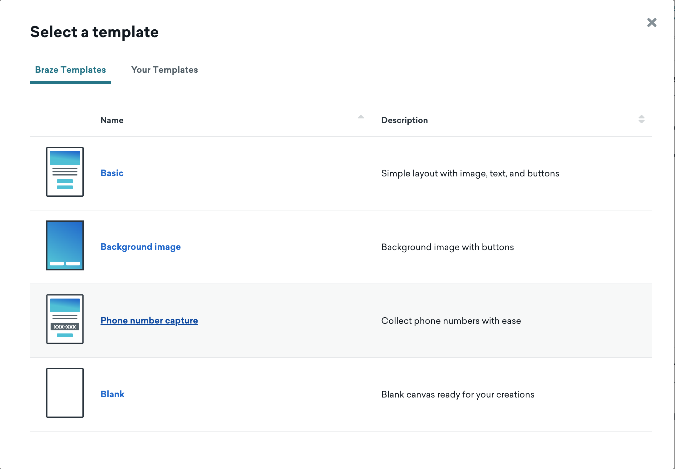
You can also access all templates from the Templates section of the dashboard.
Step 3: Add additional pages (optional)
Adding pages to your in-app message lets you guide users through a sequential flow, like an onboarding flow or welcome journey. You can manage pages from the Pages section of the Build tab.
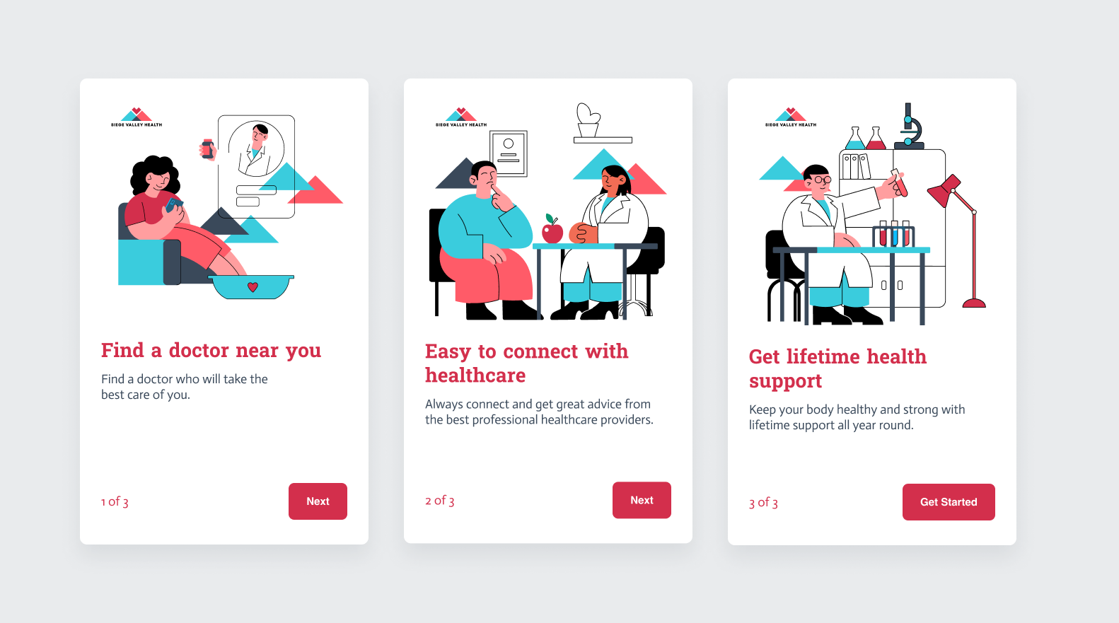
In-app messages start with one page by default. To add a new page:
- Click + Add page.
- Select from the list of custom or Braze-provided templates.
- Name the page something meaningful. This will help you when connecting pages together.
You can add up to 10 pages per in-app message.
To duplicate an existing page:
- Hover over the page in the list and select to open more options.
- Click Duplicate.
- Name the page something meaningful. This will help you when connecting pages together.
To delete or rename a page:
- Hover over the page in the list and select to open more options.
- Select Rename or Delete.
Step 3a: Connect pages together
Multi-page in-app messages are sequential, which means users interact with the message by tapping or clicking to move to the next page in the flow.
To connect pages together:
- Select your starting page.
- Select a button or image element in the canvas.
- Set On-click behavior to Go to page.
- Select the page you want to link to from the starting page.
- Continue until all pages are linked.
If a page is not linked to any other page, the message can’t be launched.
Users can press the close X button to exit the message at any time. This button can’t be removed.
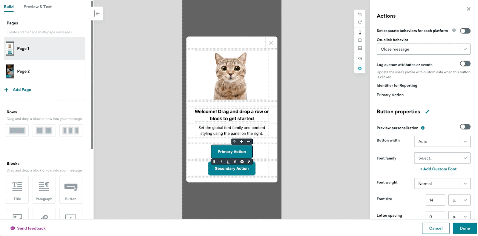
Step 4: Build and design your in-app message
Here’s where your message gets to strut down the runway, dressed in your brand’s signature style.
- For a list of available editor blocks and their properties, refer to Editor blocks.
- For help customizing the look and feel of your message, check out Style settings.
Step 5: Test your in-app message
The Preview & Test section allows you to preview your in-app messages across different devices and send a test message to your device. Here, you can ensure that the details are aligned across all your platforms for your drag-and-drop in-app message campaign. It’s extremely important to always test your in-app messages before sending your campaigns to help you visualize what your final message will look like from your user’s perspective.
Preview message as a user
To send a test to either Content Test Groups or individual users, push must be enabled on your test devices before sending.
You can preview messages from the Preview & Test tab, as though you were a user. You can select a specific user, a random user, or create a custom user:
- Random User: Braze will randomly select a user from the database and preview the in-app message based on their attributes or event information.
- Select User: You can select a specific user based on their email address or external_id. The in-app message will preview based on that user’s attributes and event information.
- Custom User: You can customize a user. Braze will offer inputs for all available attributes and events. You can enter any information you would like to see in the preview email.
Test checklist
- Have you tested the message on different devices?
- Do the images and media show up and act as expected?
- Does the Liquid function as expected? Have you accounted for a default attribute value in the event that the Liquid returns no information?
- Is your copy clear, concise, and correct?
- Do your buttons direct the user where they should go?
Frequently asked questions
Why are body clicks not appearing on my analytics page?
Body clicks are not automatically collected for in-app messages created with the drag-and-drop editor. For more details, refer to the SDK changelogs for iOS and Android.
Can I segment based on button clicks?
Yes, you can segment based on button clicks for up to two buttons in your message. To do so, set the Identifier for Reporting for your buttons to “0” and “1”, which will correspond to the segmentation filters “Clicked in-app message button 1” and “Clicked in-app message button 2” respectively.
Can I customize my in-app message using custom HTML or JavaScript or transfer existing HTML messages into the editor?
You can’t directly transfer existing HTML messages into the editor, but you can insert raw HTML, CSS, and JavaScript into a Custom Code block. You can use Custom Code blocks to embed third-party videos and advanced Liquid, such as Connected Content or conditional statements.
How can I create a slideup in-app message?
Currently the editor is limited to modal and fullscreen messages only. You can switch between display types in the Message container section of the Message styles panel.
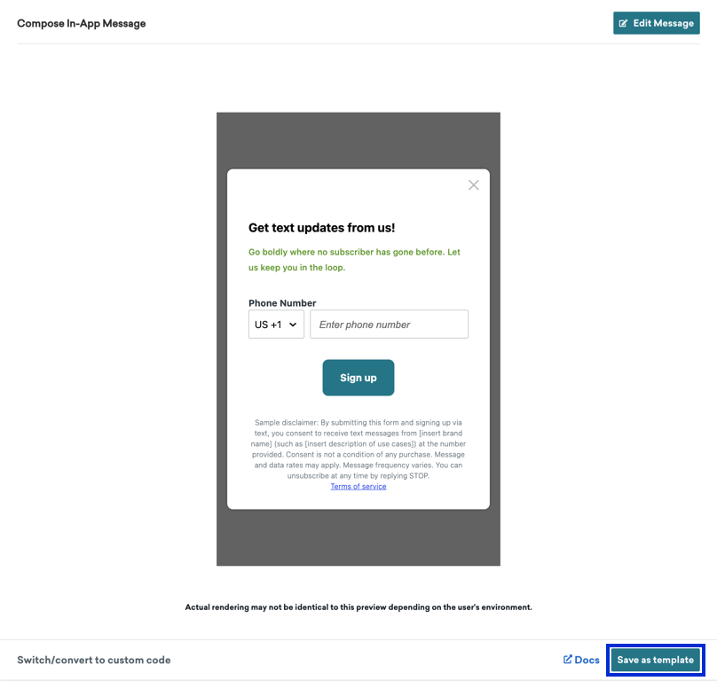
Can I save my in-app message as a template after I build it within my campaign or Canvas?
Yes. For any in-app message you want to re-use in a future campaign or Canvas step, you can save it as a custom template using the Save as template button, available after you exit the editor. Before you can save it as a template, you must first launch the campaign OR save it as a draft.
You can also create and save in-app message templates by navigating to Templates > In-App Message Templates.
 Edit this page on GitHub