Industry Benchmarks dashboard
The Industry Benchmarks dashboard compares your workspace’s engagement performance against aggregated, privacy-conscious benchmarks from peer companies in each industry.
Use the Industry Benchmarks dashboard to compare your email, push, Content Card, and SMS performance to industry peers and to identify channels and regions where there are opportunities to optimize.
To view the Industry Benchmarks dashboard, go to Analytics > Dashboard Builder, then select Industry Benchmarks. If the dashboard has no data, select Run Dashboard to generate the latest results. Use the filters at the top of the dashboard to refine results by industry vertical or timeframe.
About the dashboard
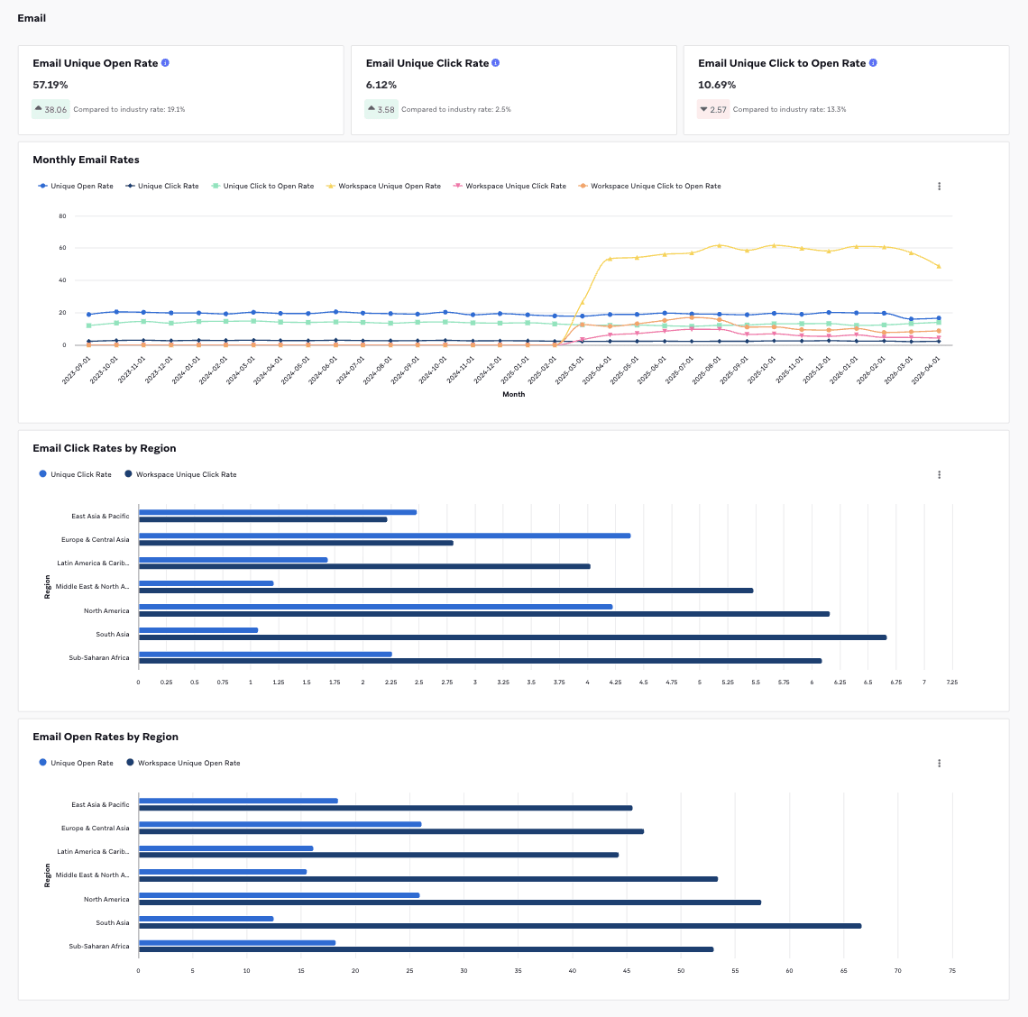
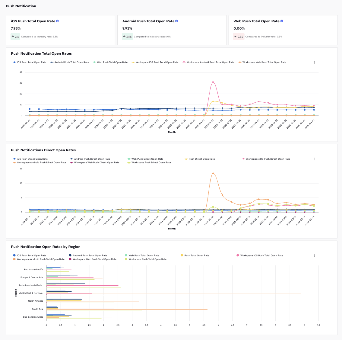
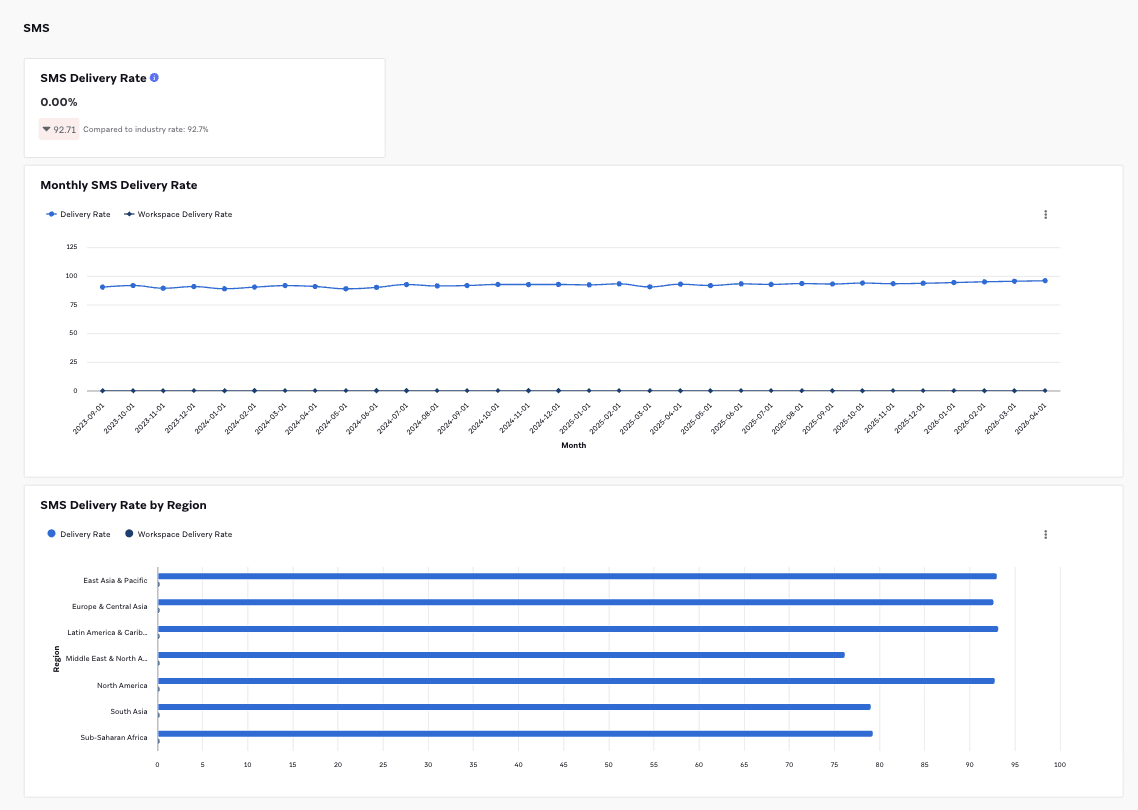
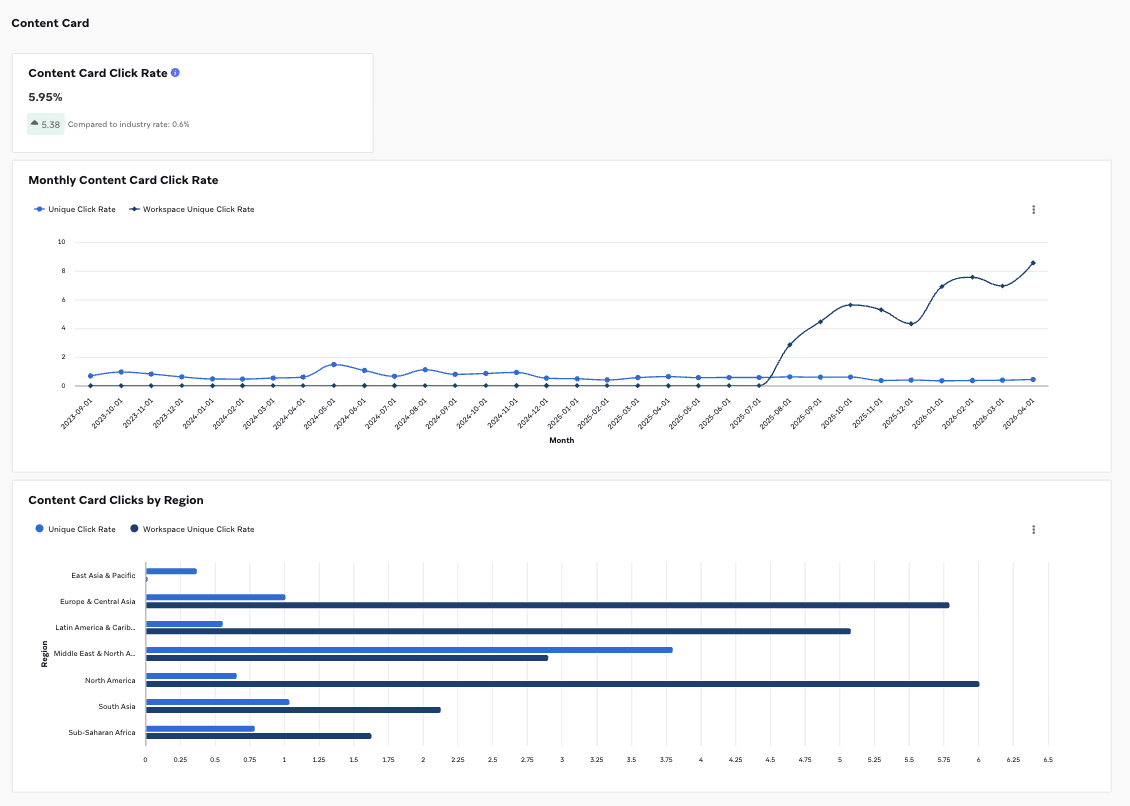
The dashboard is organized into four channel sections: Email, Push Notification, Content Card, and SMS:
| Section | Description |
|---|---|
| KPI cards | Show your workspace’s rate for each key metric, along with the delta compared to the industry rate. A green up arrow indicates your workspace is higher than the industry rate; a red down arrow indicates it is lower. |
| Monthly trend chart | Plots your workspace rate against the industry rate over time, so you can identify seasonality and longer-term trends. |
| Regional breakdown | Breaks down your workspace rate against the industry rate across regions, so you can spot where regional performance diverges from the industry. |
In every chart, the lighter-colored series represents the industry benchmark and the darker series (prefixed with Workspace) represents your own performance.
Available metrics
Each channel-based metric is available in two types:
| Metric type | Description | Example |
|---|---|---|
| Total | Counts every engagement event. | If a user clicks three times, that is counted as three clicks. |
| Distinct | Counts unique users. | If a user clicks three times, that is counted as one click. |
Metrics are grouped by the following combinations of industry, region, sub-industry, and date:
- Industry + Date
- Industry + Region + Date
- Industry + Sub-Industry + Region + Date
Select a tab to view metrics for each channel.
| Metric | Description | Formula |
|---|---|---|
| Unique Open Rate | Unique Opens is the total number (or percentage) of delivered messages that have been opened by a single user at least once and are tracked over a seven-day period. This rate excludes machine opens. | Unique Opens / Unique Sends |
| Unique Click Rate | Unique Clicks is the distinct number of recipients who have clicked a link within a message at least once and is measured by dispatch_id. | Unique Clicks / Unique Sends |
| Unique Click to Open Rate | The percentage of users who clicked an email after opening it. | Unique Clicks / Unique Opens |
Push metrics are available for iOS, Android, Web, and across all platforms combined.
| Metric | Description | Formula |
|---|---|---|
| Direct Open Rate | Direct Opens is the total number (or percentage) of users who opened your app or website by directly pressing the notification. | Direct Opens / Unique Sends |
| Influenced Open Rate | Influenced Opens is the total number (or percentage) of users who opened the app after the push notification was sent, without directly opening the push. | Influenced Opens / Unique Sends |
| Total Open Rate | Opens are instances including both Direct Opens and Influenced Opens in which the Braze SDK has determined, using a proprietary algorithm, that a push notification has caused a user to open the app. | (Direct Opens + Influenced Opens) / Unique Sends |
| Metric | Description | Formula |
|---|---|---|
| Delivery Rate | Deliveries is the total number (or percentage) of message requests that are accepted by the receiving server. This doesn’t mean the message was delivered to a device, only that the message was accepted by the server. | Deliveries / Unique Sends |
| Short Link Click Rate | The percentage of users who clicked a short link after receiving an SMS. | Short Link Clicks / Unique Sends |
| Metric | Description | Formula |
|---|---|---|
| Click Rate | The percentage of users who received a Content Card and clicked a link. | Unique Clicks / Unique Impressions |
Methodology
Braze benchmarks are calculated using a three-step process designed to produce stable, representative figures.
Step 1: Dynamic sampling
Rather than analyzing every data point, Braze selects a representative sample. The sampling method over-samples smaller user groups for adequate representation and adjusts for company size so that a small number of very large companies don’t skew the results for an entire industry.
Step 2: Outlier removal
Braze identifies and removes statistical outliers. This significantly reduces volatility in the data with minimal impact on average performance rates, meaning anomalies are removed without changing the underlying trends.
Step 3: Post-stratification weighting
The sample is weighted to mirror the real-world population. Weights are applied to subgroups to correct any imbalances left over from sampling, resulting in final benchmarks that are representative and unbiased.
Data governance
- Refresh cycle: Data refreshes monthly on the 5th of every month and is current through the last completed month.
- Privacy: All benchmarks are aggregated and de-identified to protect user information.