Creative Details
Before you get creative with our in-app messages, you should know some of the guidelines. All in-app messages templates are designed to display varying lengths of text and sizes of images across modern devices. To ensure your message displays well on all phones, tablets, and computers, we recommend you follow these guidelines and always test your messages before launching.
Specifications by message type
Content guidelines
Text
For in-app message bodies or headers, we recommend you keep it short and sweet—one to two lines for headers and up to three for bodies. After three lines, the message will likely need to vertically scroll, and users might not engage with all of the content. The threshold that triggers the scroll can vary depending on the end user’s device size, custom styling, or presence of images within messages, but three lines is usually safe.
If you are using the newest generation of in-app messages (Generation 3), you’ll find that the fonts default to the Operating System default Sans Serif for iOS and Android. Web in-app messages will default to Helvetica.
Images
Our guidelines for images are more structured than those for text, as we want to ensure your messages display as intended, and beautifully across phones, tablets, and computers of all models and sizes.
In general, Braze recommends using images that fit into a 16:10 screen.
- All images must be less than 5 MB.
- We only accept PNG, JPEG, and GIF file types.
- We recommend hosting images in the media library to enable the Braze SDK to download assets from our CDN for offline message display.
- For fullscreen messages, follow our guidelines for image safe zone.
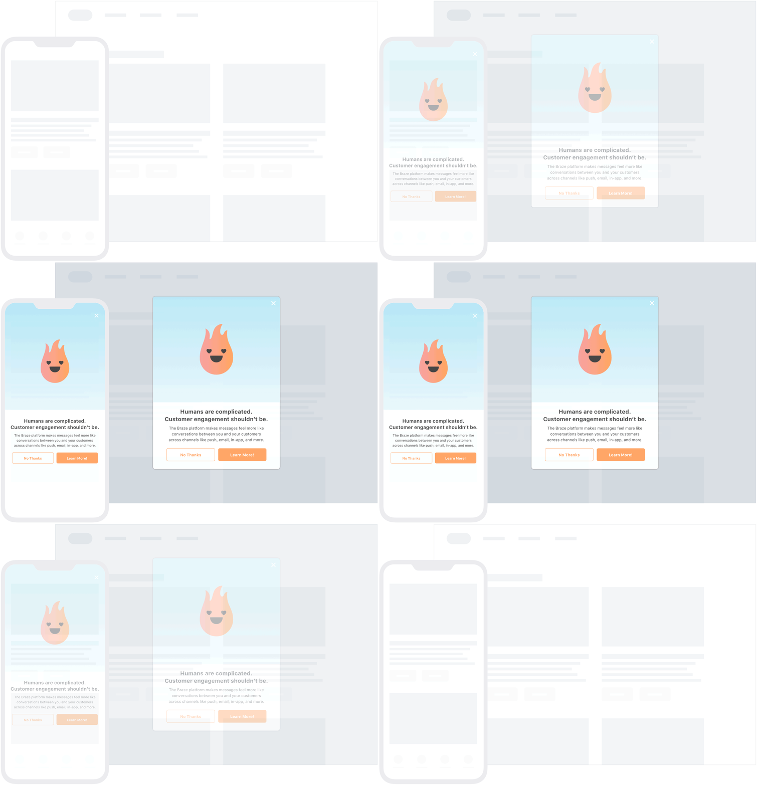
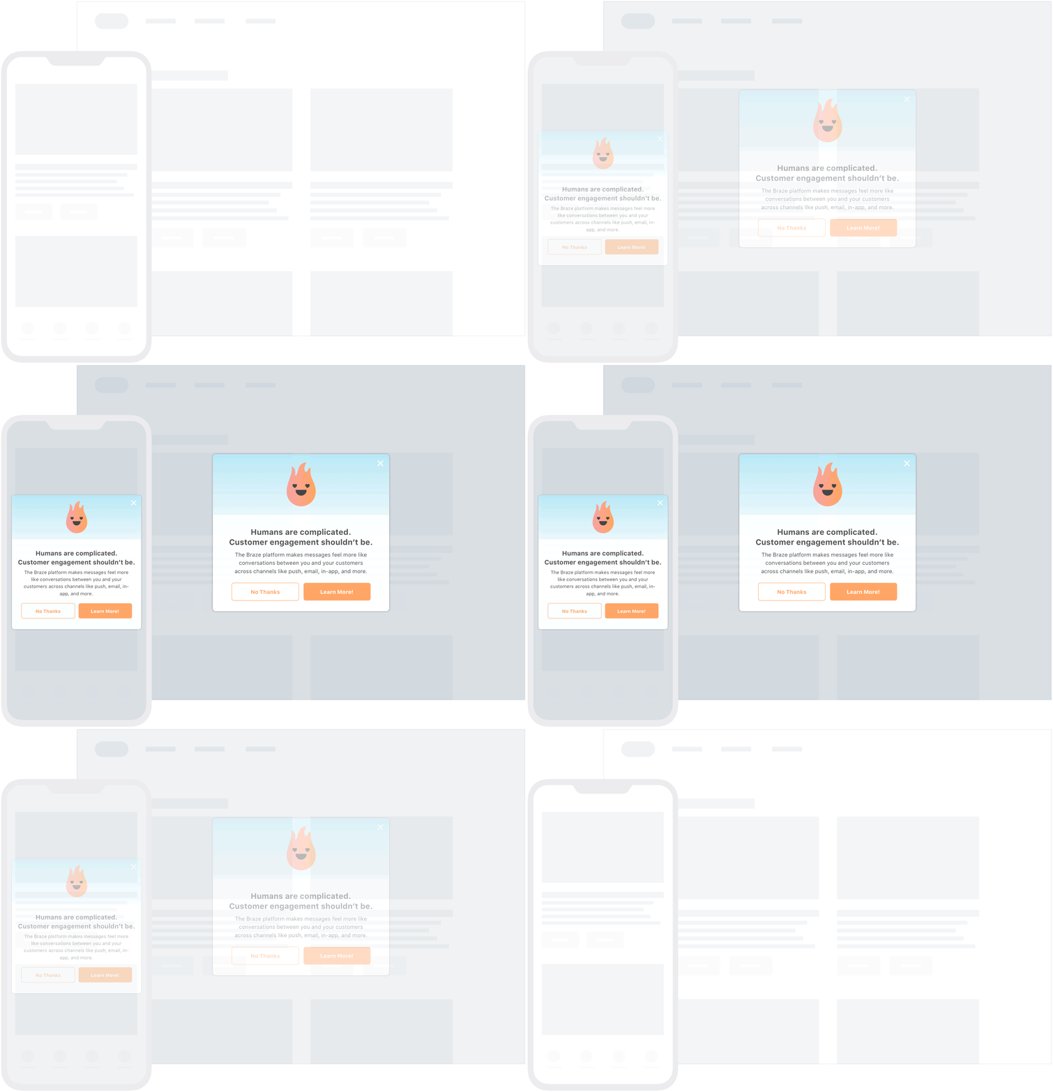
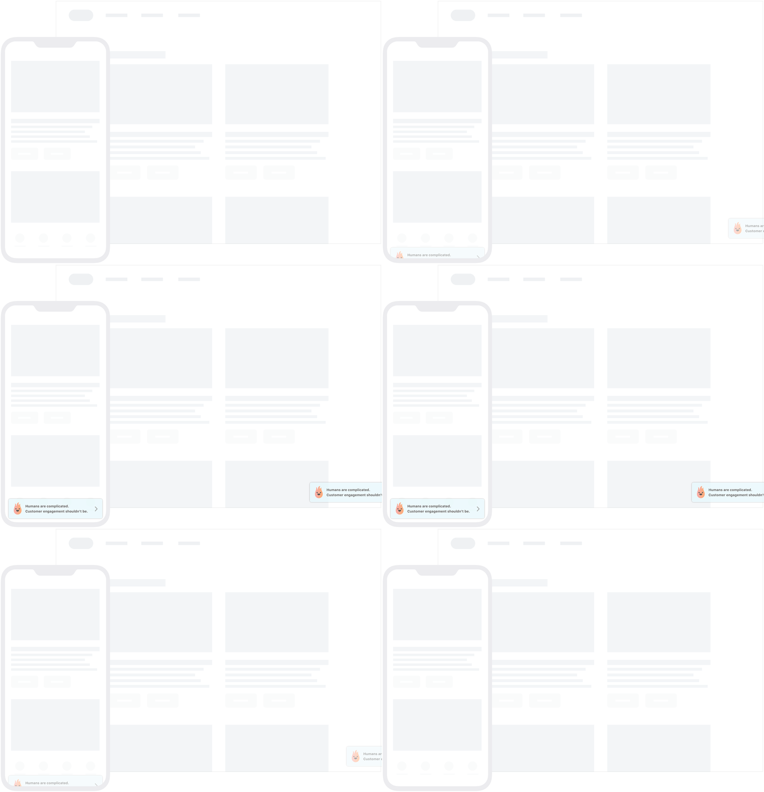
Create assets with confidence! Our in-app message image templates and safe zone overlays are designed to play nicely with devices of all sizes. Download Design Templates ZIP

| Layout | Asset Size | Notes |
|---|---|---|
| Image + Text | 6:5 aspect ratio High-res 1200 x 1000 px Minimum 600 x 500 px |
Cropping can occur on all sides, but the image will always fill the top 50% of the viewport |
| Image Only | 3:5 aspect ratio High-res 1200 x 2000 px Minimum 600 x 1000 px |
Cropping can occur on the left and right edges on taller devices |

| Layout | Asset Size | Notes |
|---|---|---|
| Image + Text | 29:10 aspect ratio High-res 1450 x 500 px Minimum 600 x 205 px |
Tall images will scale down and be horizontally centered. Wide images will be clipped on the left and right edges. |
| Image Only | Nearly any aspect ratio High-res up to 1200 x 2000 px Minimum 600 x 600 px |
The message will resize to fit images of most aspect ratios. |
GIFs and videos
Braze currently supports GIFs for Web (included), Android, and iOS (included) in-app messaging, given that it has been enabled during the desired platform integration. For more on video in in-app messages, see our Customization documentation.
Additional considerations
Braze in-app messages have both global and individual creative specifications. For more information about fully customizing in-app messages, go to our Customization page.
