Creating custom Content Cards
This article discusses the basic approach you’ll use when implementing custom Content Cards, as well as three common use cases: banner images, a message inbox, and a carousel of images.
Braze provides different Content Card types: imageOnly, captionedImage, classic, classicImage, and control. These can be used as a starting place for your implementations, tweaking their look and feel.
You can also display Content Cards in a completely custom manner by creating your own presentation UI populated with data from the Braze models. Parse the Content Card objects and extract their payload data. Then, use the resulting model data to populate your custom UI—the “run” phase of the crawl, walk, run approach.
Customization overview
Depending on your use case, the exact implementation of your custom Content Card will vary a bit, but you will want to follow this basic formula:
- Build your own UI
- Listen to data updates
- Manually log analytics
Step 1: Create a custom UI
First, create your own custom fragment. The default ContentCardFragment is only designed to handle our default Content Card types, but is a good starting point.
First, create your own custom view controller component. The default BrazeContentCardUI.ViewController is only designed to handle our default Content Card types, but is a good starting point.
First, create your custom HTML component that will be used to render the cards.
Step 2: Subscribe to card updates
Then, register a callback function to subscribe for data updates when cards are refreshed.
Step 3: Implement analytics
Content Card impressions, clicks, and dismissals are not automatically logged in your custom view. You must implement each respective method to ensure all metrics get properly logged back to Braze dashboard analytics.
Content Card placements
Content Cards can be used in many different ways. Three common implementations are to use them as a message center, a banner ad, or an image carousel. For each of these placements, you will assign key-value pairs (the extras property in the data model) to your Content Cards, and based on the values, dynamically adjust the card’s behavior, appearance, or functionality during runtime.
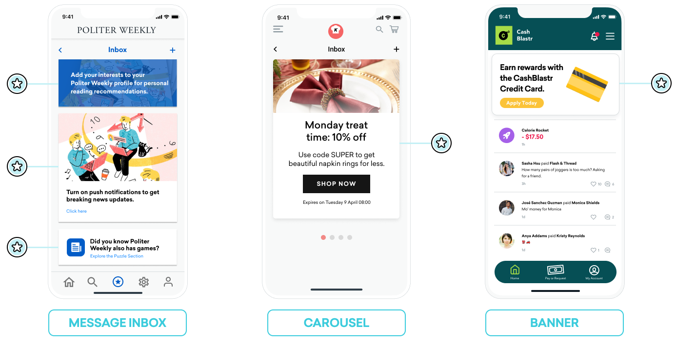
Message inbox
Content Cards can be used to simulate a message center. In this format, each message is its own card that contains key-value pairs that power on-click events. These key-value pairs are the key identifiers that the application looks at when deciding where to go when the user clicks on an inbox message. The values of the key-value pairs are arbitrary.
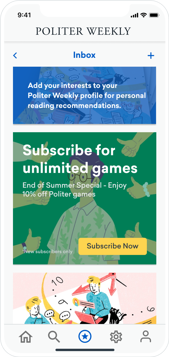
Here is an example dashboard configuration you might use to create two message cards: one message is a call to action for a user to add their preferences to receive targeted reading recommendations, and one provides a coupon code to a segment of new subscribers.
Example key-value pairs for the reading recommendation card could be:
- body: Add your interests to your Politer Weekly profile for personal reading recommendations.
- style: info
- class_type: notification_center
- card_priority: 1
Example key-value pairs for a new subscriber coupon could be:
- title: Subscribe for unlimited games
- body: End of Summer Special - Enjoy 10% off Politer games
- buttonText: Subscribe Now
- style: promo
- class_type: notification_center
- card_priority: 2
- terms: new_subscribers_only
Your marketers could make this Content Card available only for a segment of new users.
You would handle each of the values. Keys like body, title, and buttonText might have simple string values your marketers can set. Keys like terms might have values that provide a small collection of phrases approved by your Legal department. You would decide how to render style and class_type on your app or site.
Further explanation for Android
In the Android and FireOS SDK, the message center logic is driven by the class_type value that is provided by the key-value pairs from Braze. Using the createContentCardable method, you can filter and identify these class types.
Using class_type for on click behavior
When we inflate the Content Card data into our custom classes, we use the ContentCardClass property of the data to determine which concrete subclass should be used to store the data.
1
2
3
4
5
6
7
8
9
10
11
 private fun createContentCardable(metadata: Map<String, Any>, type: ContentCardClass?): ContentCardable?{
        return when(type){
            ContentCardClass.AD -> Ad(metadata)
            ContentCardClass.MESSAGE_WEB_VIEW -> WebViewMessage(metadata)
            ContentCardClass.NOTIFICATION_CENTER -> FullPageMessage(metadata)
            ContentCardClass.ITEM_GROUP -> Group(metadata)
            ContentCardClass.ITEM_TILE -> Tile(metadata)
            ContentCardClass.COUPON -> Coupon(metadata)
            else -> null
        }
    }
Then, when handling the user interaction with the message list, we can use the message’s type to determine which view to display to the user.
1
2
3
4
5
6
7
8
9
10
11
12
13
14
15
16
17
18
19
20
21
22
23
24
25
override fun onCreate(savedInstanceState: Bundle?) {
        super.onCreate(savedInstanceState)
        //...
        listView.onItemClickListener = AdapterView.OnItemClickListener { parent, view, position, id ->
           when (val card = dataProvider[position]){
                is WebViewMessage -> {
                    val intent = Intent(this, WebViewActivity::class.java)
                    val bundle = Bundle()
                    bundle.putString(WebViewActivity.INTENT_PAYLOAD, card.contentString)
                    intent.putExtras(bundle)
                    startActivity(intent)
                }
                is FullPageMessage -> {
                    val intent = Intent(this, FullPageContentCard::class.java)
                    val bundle = Bundle()
                    bundle.putString(FullPageContentCard.CONTENT_CARD_IMAGE, card.icon)
                    bundle.putString(FullPageContentCard.CONTENT_CARD_TITLE, card.messageTitle)
                    bundle.putString(FullPageContentCard.CONTENT_CARD_DESCRIPTION, card.cardDescription)
                    intent.putExtras(bundle)
                    startActivity(intent)
                }
            }

        }
    }
Using class_type for on click behavior
When we inflate the Content Card data into our custom classes, we use the ContentCardClass property of the data to determine which concrete subclass should be used to store the data.
1
2
3
4
5
6
7
8
9
10
11
12
13
14
15
16
17
18
19
20
21
22
23
24
25
26
private ContentCardable createContentCardable(Map<String, ?> metadata,  ContentCardClass type){
    switch(type){
        case ContentCardClass.AD:{
            return new Ad(metadata);
        }
        case ContentCardClass.MESSAGE_WEB_VIEW:{
            return new WebViewMessage(metadata);
        }
        case ContentCardClass.NOTIFICATION_CENTER:{
            return new FullPageMessage(metadata);
        }
        case ContentCardClass.ITEM_GROUP:{
            return new Group(metadata);
        }
        case ContentCardClass.ITEM_TILE:{
            return new Tile(metadata);
        }
        case ContentCardClass.COUPON:{
            return new Coupon(metadata);
        }
        default:{
            return null;
        }
    }
}
Then, when handling the user interaction with the message list, we can use the message’s type to determine which view to display to the user.
1
2
3
4
5
6
7
8
9
10
11
12
13
14
15
16
17
18
19
20
21
22
23
24
25
26
27
28
@Override
protected void onCreate(Bundle savedInstanceState) {
        super.onCreate(savedInstanceState)
        //...
        listView.setOnItemClickListener(new AdapterView.OnItemClickListener() {
            @Override
            public void onItemClick(AdapterView<?> parent, View view, int position, long id){
               ContentCardable card = dataProvider.get(position);
               if (card instanceof WebViewMessage){
                    Bundle intent = new Intent(this, WebViewActivity.class);
                    Bundle bundle = new Bundle();
                    bundle.putString(WebViewActivity.INTENT_PAYLOAD, card.getContentString());
                    intent.putExtras(bundle);
                    startActivity(intent);
                }
                else if (card instanceof FullPageMessage){
                    Intent intent = new Intent(this, FullPageContentCard.class);
                    Bundle bundle = Bundle();
                    bundle.putString(FullPageContentCard.CONTENT_CARD_IMAGE, card.getIcon());
                    bundle.putString(FullPageContentCard.CONTENT_CARD_TITLE, card.getMessageTitle());
                    bundle.putString(FullPageContentCard.CONTENT_CARD_DESCRIPTION, card.getCardDescription());
                    intent.putExtras(bundle)
                    startActivity(intent)
                }
            }

        });
    }
Carousel
Content Cards can be set in a carousel feed where a user can swipe horizontally to view additional featured cards.
To create a Content Card carousel, implement logic that observes for changes in your Content Cards and handles Content Card arrival. By default, Content Cards are sorted by created date (newest first), and a user sees all cards they are eligible for. Implement client-side logic to display a specific number of cards in the carousel at any one time.
With that said, you could order and apply additional display logic in a variety of ways. For example, you could select the first five Content Card objects from the array or introduce key-value pairs to build conditional logic around.
If you’re implementing a carousel as a secondary Content Cards feed, refer to Customizing the default Content Card feed to ensure you sort cards into the correct feed based on key-value pairs.
Banner
Content Cards don’t have to look like “cards.” For example, Content Cards can appear as a dynamic banner that persistently displays on your home page or at the top of designated pages.
To achieve this, your marketers will create a campaign or Canvas step with a Image Only type of Content Card. Then, set key-value pairs that are appropriate for using Content Cards as supplemental content.
 Edit this page on GitHub