Beware Red Dot Blindness: A Human-First Approaching to Badging
Published on March 18, 2022/Last edited on March 18, 2022/8 min read
Kimberley Godfrey
UX DesignerLet’s talk about the red dot. Our brains are wired to recognize red. It says: “Pay attention to me”. Because of this association with “warnings”, its use is widespread across our day-to-day life. So when social media adopted this elegant red mark to “alert” us to in-app happenings, it made sense and we began to associate the red dot with new things—messages, likes, comments, or maybe even a new friend request. And now they’re everywhere!
The red dot has become a big part of our lives, popping up in gaming, video streaming, social media, and more to indicate that there’s a notification that needs our attention. We are conditioned to react and will click whatever they mark. In short, they have become UX mosquitoes. And it’s an itch we love to scratch!
However, there is a problem—it seems our phones have become laden with dots. Each app is fighting for our attention, monopolizing their users' time. With so much red, it can become an annoyance. This puts the dot in danger. Why? Because it eliminates impact. If it’s always there, it might as well not be there at all.
What Are Badges?
In the context of a mobile app, a badge is the red circle that appears on the upper right hand corner of the app’s icon on a mobile device or Mac computer. (On PCs, badges are generally blue.) The white numbers inside that circle display the “badge count,” representing the number of unread messages waiting for a given user when they next open the app. Generally, the badge count for an app reflects the number of unread push notifications that user has received from the app in question. That being said, it’s also possible to use this tool to highlight other unread messages, including in-app messages, News Feed Cards, and Content Cards.

By visually showcasing messages that a user hasn’t yet engaged with, brands can create a sense of urgency for users in connection with opening their app and nudge lapsing users to log another session. Think of it as a wordless call to action that is eye-catching, effective, costs nothing, and can do a lot to encourage engagement with minimal effort.
Beware of Red Dot Blindness
When people are overloaded with advertisements, they learn to ignore them, forming a mental block towards anything that resembles ads, were close to ads, or appears in locations traditionally dedicated to ads. This phenomenon is known as “banner blindness”, and now we’re starting to see it happening with notification badges. Given that, what can brands do to combat this dynamic and improve notification experience?
3 Ways to Improve Your Brand’s Notification Experience
1. Choose your push notification type wisely
Using the wrong method to communicate can have a negative impact on the customer experience—and, if it disrupts their day or feels irrelevant, may even actively annoy the people receiving the message. As powerful as the red dot is, it is not “one-size-fits-all.” Push notifications come in many shapes and sizes, so make sure you’re choosing the right one for the job at hand.
While marketer have the ability to make their notifications more attention-grabbing—by adding push-related badges (that is, the small red circles that appear on the corner of your app icon) and/or by customize push messages to include sounds or to require users to engage with them before they disappear—these approaches generally require customer consent and can be counterproductive if sent to recipients who aren’t open to them. With Apple introducing a new classification scale to support the filtering of messages, it’s only gotten more important for marketers to fit their outreach to the people they’re communicating with. So, when you’re building and classifying your notifications, do it with the following factors in mind:
- The type of information being communicated
- The urgency of the information
- And whether or not the user needs to take action as a result of the information
To make sure you’re using the ideal communication method, it helps to first gain an understanding of the humans using your app.
2. Put humans at the center of your design
Good design is not just about making things pretty. It's about understanding the emotional or behavioral needs of your users. So consider using empathy as a tool. Understanding the people you are communicating with will help to paint a picture of their daily life, revealing what ways of engaging them will fit seamlessly into their life. Ask the whos, whats, whens, wheres, and whys:
- Who are your users?
- Why are they here?
- What are they thinking and feeling?
- Where would notifications be of value to them?
- When is the best time to reach them?
- Why is this important to them?
You may find after carrying out this exercise that the ideal campaign is one using a different messaging channel (for instance, in-app messages or email), or even no campaign at all. That’s okay. Push notifications and their badges can be a powerful tool for driving users to take action, but they aren’t a one-size-fits-all solution for customer engagement, so don’t fall into the trap of treating them that way.
Beware of Dark Patterns
Dark patterns are an easy trap to fall into. As designers, we know people are drawn to the color red, and that there is a recipe for building a habit (trigger + action + variable reward + investment). Typically, designers are given “boxes to tick” that help in measuring the success of an app, so when your boss says “engagement needs to be up!” that can put on pressure to lure customers to spend more time in-app. However, don’t lose sight of the fact that good design should be:
- Useful
- Usable
- Delightful
Pestering people with “clickbait” notifications may work short term, but if you us this approach too often, you run the risk of frustrating recipients and potentially leading them to engage less or even uninstall your app. In contrast, sending communications that are relevant and useful will bring real value, both for users and for your brand.
Ultimately, the success of your business shouldn’t be measured by the time people spend using your app or website, but rather the value and benefit it brings to those people. With Apple and Google releasing features designed to help consumers better manage how much time they spend on their devices, embracing ethical design isn’t just a nice thing for brands to do—it’s a way to reach people effectively in a world where humans are being put back at the center of the tech experience.
3. Communicate appropriately
Integrating with your customers' lives means exercising a certain amount of tact when it comes to your messaging strategy. If you start by ensuring that you understand where and when you are approaching users and the “urgency vs. importance” of your message, you can then select a method that’s fit for purpose.
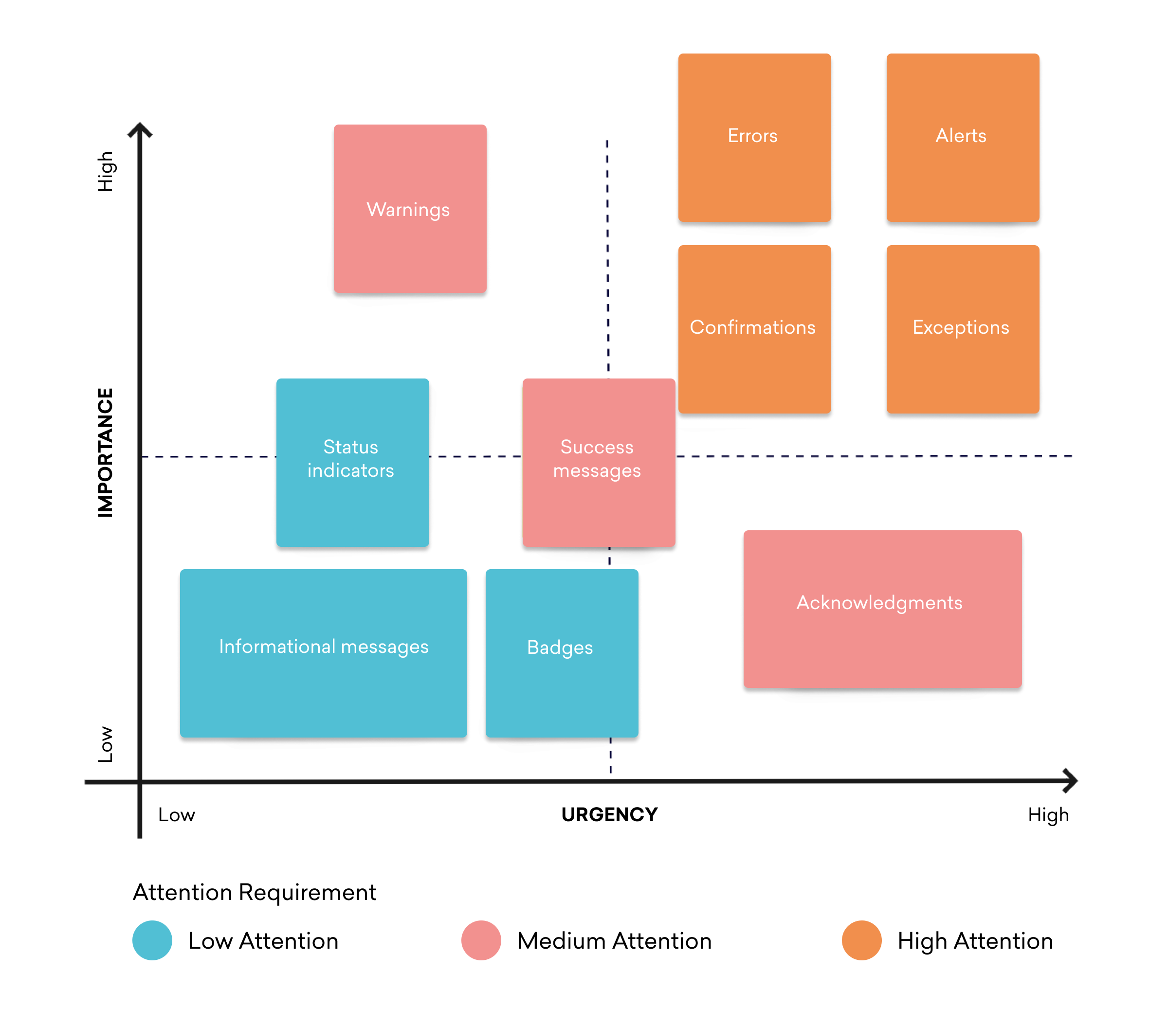
Notifications are classified into three levels of importance, based on the amount of attention that they require from the user: High, Medium, and Low. They are then further defined depending on their attributes.
High
- Alerts (immediate attention required)
- Errors (immediate action required)
- Exceptions (system anomalies, something didn’t work)
- Confirmations (potentially destructive actions that need user confirmation to proceed)
Medium
- Warnings (no immediate action required)
- Acknowledgments (feedback on user actions)
- Success messages
Low
- Informational messages (aka passive notifications, something is ready to view)
- Badges (typically on icons, signifying something new since last interaction)
- Status indicators (system feedback)
Sometimes disruption is necessary, other times subtlety is more appropriate. The important thing is to match your messaging approach to the nature of the message, in order to clearly communicate how important the outreach is and to avoid frustrating users with urgent messages that aren’t actually time-sensitive or valuable to them.
Consider Using Dark Notifications
If you’re sending a high-importance or time-sensitive message, grabbing recipients’ attention via sounds and badges may be the right approach. However, when the notification is less important, a more subtle, less invasive approach that leverages badging without interrupting things with sounds or other in-your-face approaches may work better.. These so-called “ark notifications” are sent without sound, allowing recipients to engage with the message but refraining from using an audio signal to grab their attention. The lesson? While multimodal feedback can enrich your app messaging experience, that audible ping of a notification has a time and a place. Sometimes less is more.

Final Thoughts
If you’re going to use badges as part of your messaging strategy, it’s important to do so thoughtfully. Beware of Red Dot Blindness and consider using Dark Notification badges for less intrusive alerts. In general, you want to enrich the lives of the people receiving your messages, rather than overwhelming them.
After all, while notifications are a critical tool for engaging customers effectively, sending too many can be invasive, while sending too few can lead to missed opportunities. Finding the right balance will require a culture of testing and experimentation. Data, awareness, and hindsight will help pave the way to improving your customer experience design.
Interested in learning more about notifications and how they can support your customer engagement programs? Check out our exclusive push notification guide.
Related Tags
Be Absolutely Engaging.™
Sign up for regular updates from Braze.