What’s Dark Mode?
Published on February 19, 2020/Last edited on February 19, 2020/10 min read

Sarah Wilson
Senior Product Designer, BrazeRecently, I was at a dark, dreamy concert in Brooklyn—the fog machines were pumping, the lights soft, the musicians silhouetted by an orange glow. I pulled out my phone to try to capture the magic, but when I opened one of my social media apps to film it...and wow, my eyes were blinded by the bright white interface. (Plus, I felt bad for accidentally startling my neighbors, who were very much in the moment.) If only the app had Dark Mode support, this whole experience could have been a positive one for my eyes, my social anxiety, and the concert-goers around me.
Last year, both Apple and Google announced that they’d be including Dark Mode support for the latest versions of their mobile operating systems. And while I’ve seen a number of brands create wonderful dark styles for their apps—and have taken note of what excellence looks like—it’s still early days when it comes to Dark Mode. So let’s dig a little deeper into what it is, what benefits it can provide, and why it’s something your team should be thinking about.
What is Dark Mode?
In a nutshell, Dark Mode is a theme that can be used to shift the appearance of a given device’s user interface in order to make that interface (wait for it…) darker. On both Android and iOS, users can permanently enable Dark Mode or permanently disable it; if you have an Apple device, you can also activate it on a chosen schedule (or set it to go dark at night and get light come morning). Speaking for myself, I have my iPhone set to switch to Dark Mode when the sun sets and switch back when the sun rises, in order to reinforce my natural circadian rhythm and support better sleep.
In general, when we’re talking about Dark Mode, we’re talking about a visual theme where white or other lighter-colored text is displayed on a black or dark-colored background. This theme contrasts with the traditional one you usually see on smartphones and other digital devices, where dark letters are shown on a white/light-colored background (AKA Light Mode).
Why Was Dark Mode Created?
While Dark Mode has popped up on a number of different digital platforms over the past five years—Twitter, for instance, first launched its Dark Mode version in 2016—there’s no single factor driving its increased adoption.
One benefit of Dark Mode is that the darker colors that dominate the theme don’t require as much light, reducing brightness and helping batteries to run down less quickly on mobile devices. There’s also a perception that Dark Mode can help reduce eye strain, especially when reading on a digital screen at night. However, the science around whether Dark Mode is better for your eyes is unsettled; there’s some evidence that it may reduce legibility for people with normal or corrected vision while also being helpful for people with certain vision issues, including cataracts. Or maybe people are excited about Dark Mode because it’s a call back to the Apple IIe days, when every computer had a dark background and lighter text—who can say?
All that being said, now that Dark Mode is widely available on the two biggest mobile operating systems, most brands with apps that can be viewed on mobile devices are going to find that some appreciable segment of their audience will adopt this new theme to some degree. That makes it important for marketing, growth, and engagement teams to think about how they can serve up experiences that are compatible with this new way of visualizing apps.
Why Is It Important for Brands to Take Dark Mode Support Seriously?
Take a moment to think about all of the times your requests have been ignored as a consumer. That time you asked for ketchup on the side with your meal, received mint when you wanted bubblegum flavored mouthwash at the dentist, was sent the wrong size sweater after explicitly listing your size as a medium. It was frustrating—because you clearly indicated a preference and then were told, essentially, that your preference didn’t matter.
Dark Mode is an explicit user preference. A person may turn it on at different times and for different reasons, and the majority of consumers expect their apps to respect their system-level preferences. Dark Mode may not directly cause churn, but don’t discount its impact on a user’s experience.
Product and marketing teams are increasingly recognizing the importance of inclusive and personalized experiences, and Dark Mode is one small part. While it’s arguably not the most important accessibility feature (when put next to features like custom font sizes, colorblind modes, or screen readers), Dark Mode, when supported fully, prevents eye strain and light overload as a user navigates between apps supporting Dark Mode and Light Mode in a single session.
Why Don’t All Apps Support Dark Mode?
As awesome as it’d be for each phone’s operating system to automatically switch the user interface of every app into a perfect Dark Mode color scheme, that’s not possible today. Dark Mode isn’t a straight inversion of Light Mode’s colors, nor is it likely to be something that your app—or any app, for that matter—will get for free.
If your brand’s app references Android or iOS default color variables, those variables will automatically be converted to their Dark Mode counterparts, as specified by Apple or Google, when a user enables Dark Mode. But if your app has specific brand colors, developers will need to replace each and every on-brand color with a second set of styles. And, depending on how well-structured the code is, this could take considerable design, implementation, and QA time.
What Does It Take to Implement Dark Mode?
Beyond the developer time and effort it will take, implementing Dark Mode takes a lot of thought and care when it comes to the look of your app. Allowing your developers to throw in their own colors for Dark Mode and quickly pushing an update out the door is going to do more harm than good.
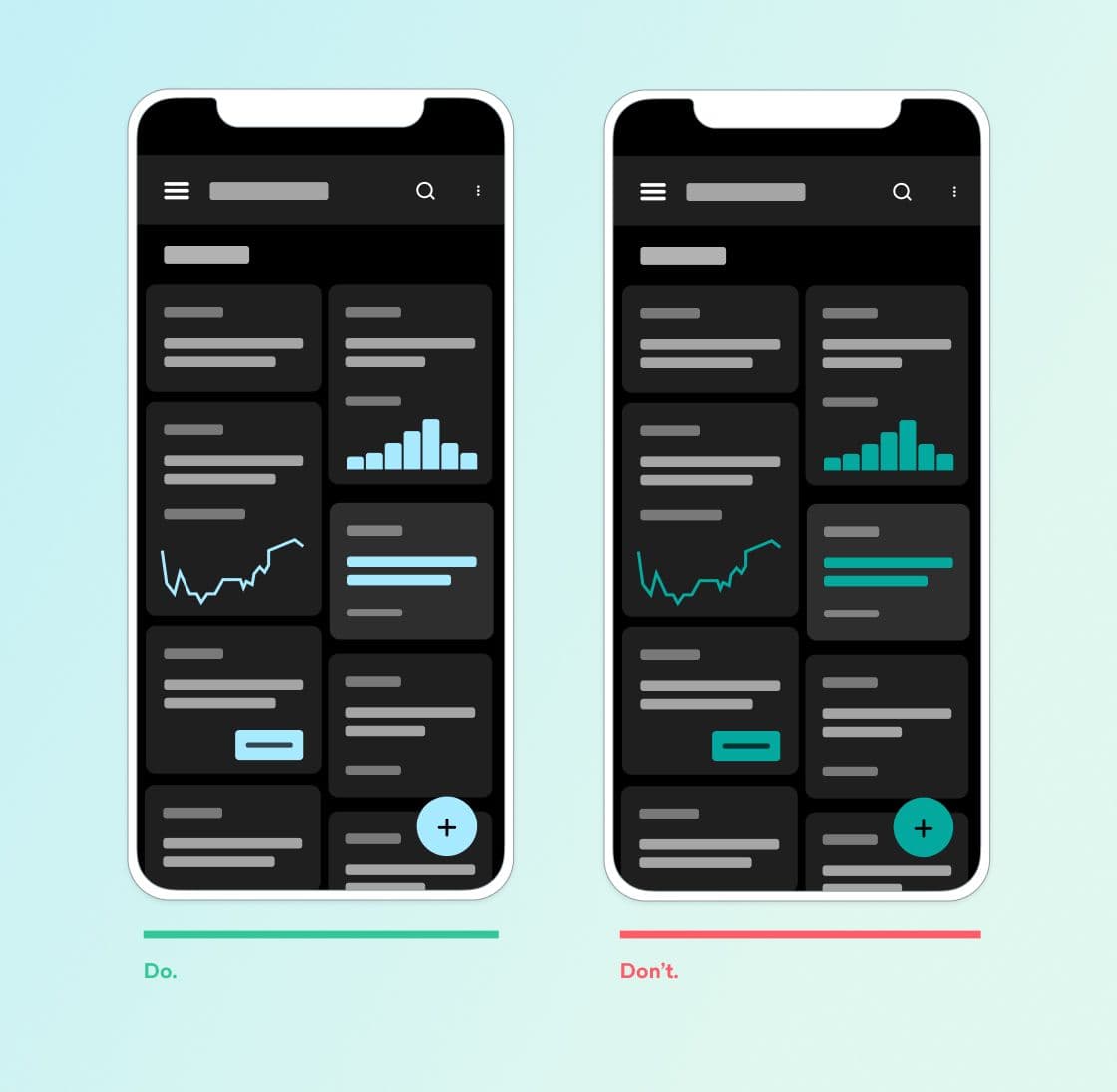
As a product designer, I know that user interface design is an art, not a science. Your designers have already done a lot of work to ensure that each page has a clear visual hierarchy (CTAs are prominent, navigational elements are distinct, etc.), that colors have cohesive semantic meaning (red for error, say, green for success, and gray for inactive), and so on. To avoid undoing all that effort, your Dark Mode design needs to involve more than making all backgrounds black and then sprinkling in some brand colors. But, beyond that, doing Dark Mode right also requires careful design attention in order to remain on brand and maintain usability—so your designers will need to update components like icons and images in order to play nicely with the new dark backgrounds.
Once you have your Dark Mode designs locked down and moved into development, expect your team to spend a significant amount of time on QAing and reviews—there will likely be a lot of one-off color codes and interaction edge cases that you haven’t anticipated and will need to fix. As always, test extensively before deploying—and make sure to test the messages you send in context, so you can see how they display against your brand’s Dark Mode theme.
How Can You Assess the ROI for Dark Mode?
For product teams, it’s natural to seek to predict and then measure the return on investment (ROI) associated with supporting something like Dark Mode. The work that goes into supporting Dark Mode doesn’t happen in a vacuum and to make it happen, you need engineering and product design resources that come with their own associated costs. But gaming out what the upside will be for your brand can be hard.
The question, then, is where to start. Got a scrappy team? See if your product design team can do some quick mockups of a Dark Mode theme for your app and if you can get your engineering team to eyeball the level of effort needed to implement the new theme. Have more resources and more buy-in? It’s probably worth it to do some usability and accessibility testing and then carrying out some thoughtful spec-ing before you get underway and start actually implementing your designs for Dark Mode.
Once you’ve released support, see if you can get data on how many of your current users are using Dark Mode on their devices and then keep a close eye on App Store/Google Play reviews, net promoter scores (NPS), and social media posts from your audience so you can tell if sentiment is moving in a positive direction.
How Does Braze Support Dark Mode?
At Braze, finding ways to help brands support customized, relevant experiences for their users is a key area of focus. For us, it was clear from early on that introducing Dark Mode support was an important way to help our customers live up to their customers’ expectations when it comes to the in-app experience. (To learn more about the process involved in designing and building Dark Mode support within Braze, check out our piece on the Building Braze product blog.)
Here’s what we landed on when it came to rolling out Dark Mode support:
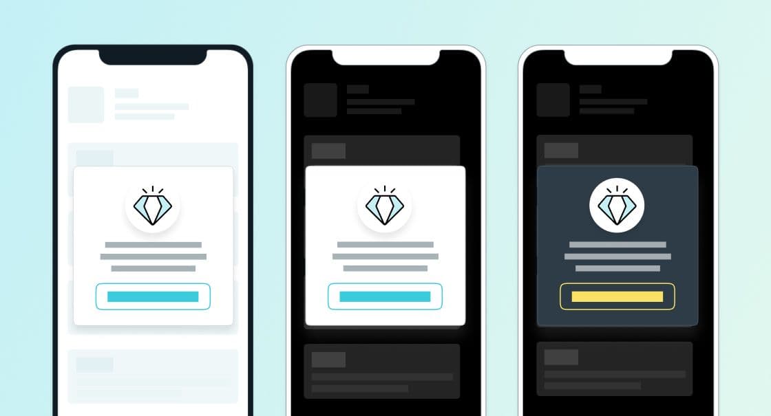
- In-App Messages: Within the Braze dashboard’s message composer, you can apply two themes to a given in-app messaging campaign—and at the time the message is displayed, the Braze SDK will apply the Light or Dark Mode styles, depending on what each individual user has selected.
- Push Notifications and SMS: Because standard push and SMS are native operating system customization (with the exception of Android Custom Push), you effectively get Dark Mode support here for free, without having to do a lot of dev work on your side.
- Content Cards: Many customers implement a custom feed rather than use our out-of-the-box UI. This lets customers customize look and feel, positioning of card elements, change the direction, CTAs, and interactions. Since the design for cards is static (you don't make a different design for each card, like you would for an IAM), customers can more extend our default card feed to apply dark mode, once, during the initial implementation.
- Email: While emails don’t need to be sent in both Light and Dark Mode styles if they’re implemented correctly, I have seen some issues where emails lack explicit background colors or look Broken when using Dark Mode themes. Thanks to the ‘prefers-color-scheme’ CSS media query, it’s now possible to design emails specifically for both dark and light themes.
To learn more about how to use Braze to ensure a Dark Mode-friendly customer experience for your users, check out our related documentation.
Final Thoughts
Today’s consumers demand brand experiences that speak to them and their own unique preferences. That can mean a cross-channel messaging approach or message personalization or intelligent channel selection—but it can also mean taking less obvious actions, such as implementing Dark Mode. By respecting your users’ explicit preferences when it comes to Light Mode versus Dark Mode, you’re levelling up user satisfaction and showing that you care about the mobile experience you’re providing.
Related Tags
Be Absolutely Engaging.™
Sign up for regular updates from Braze.
Related Content
 Article12 min read
AI email marketing: How to use AI to run smarter email programs
July 16, 2026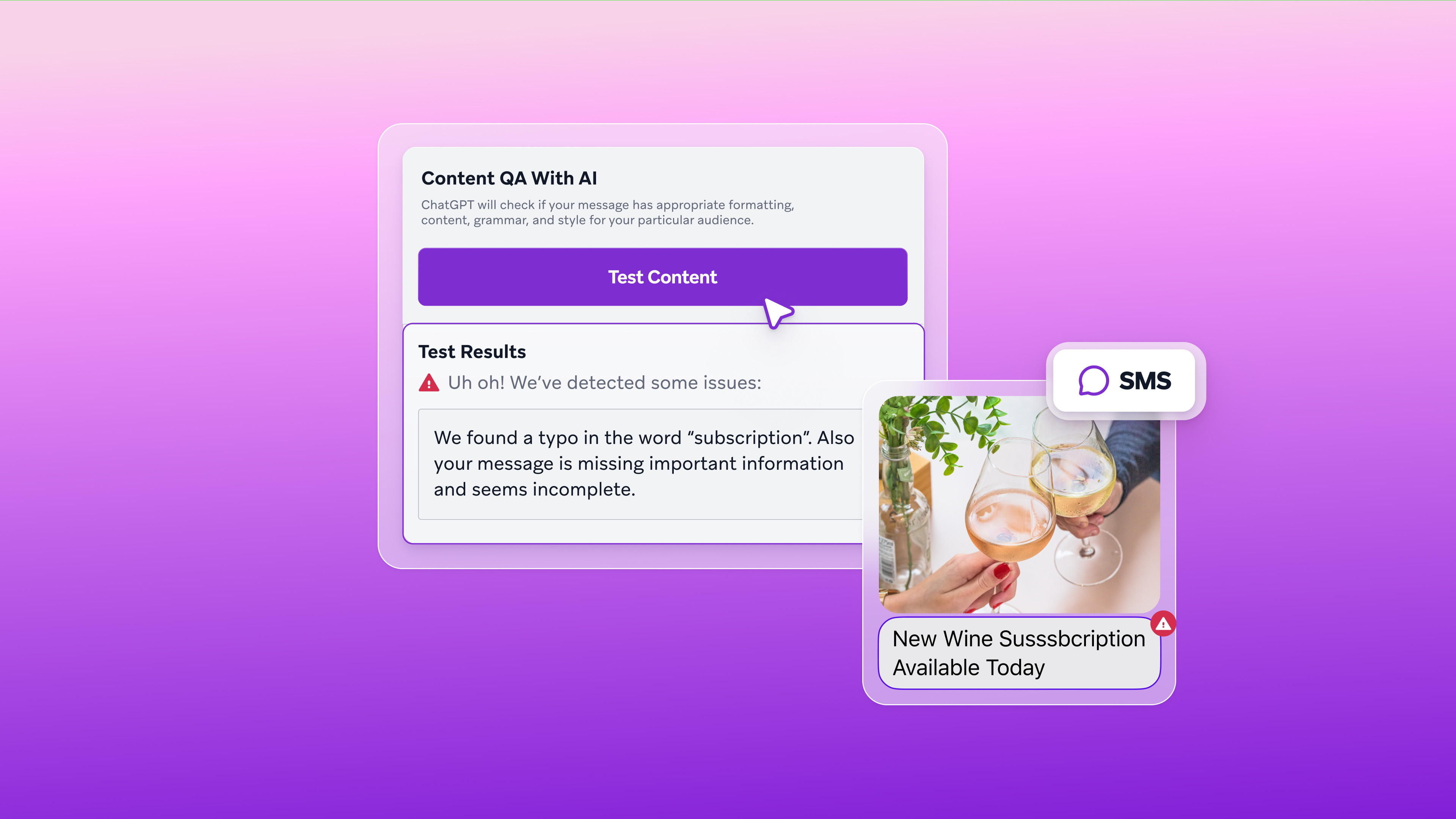 Article16 min read
Best AI marketing tools in 2026: A complete guide by category
July 16, 2026 Article7 min read
AI personalized content: How to deliver the right message to every customer at scale
July 16, 2026