Appboy Feature Release: App Usage Analytics Revamp
Published on February 17, 2014/Last edited on February 17, 2014/1 min read


Team Braze

Talking with customers, we’ve seen the impact that insights from analytics can offer. Recently, we have released a lot of great improvements to the Dashboard (including Campaign Analytics and Location Targeting upgrades), and this week the new App Usage Analytics page will continue that trend and help you utilize Appboy data to understand overall trends and patterns in user behavior. Early feedback from customers working with us during beta testing has been great, and once you log onto the Dashboard, February 19th, you’ll see the updates.
You will now have access to:
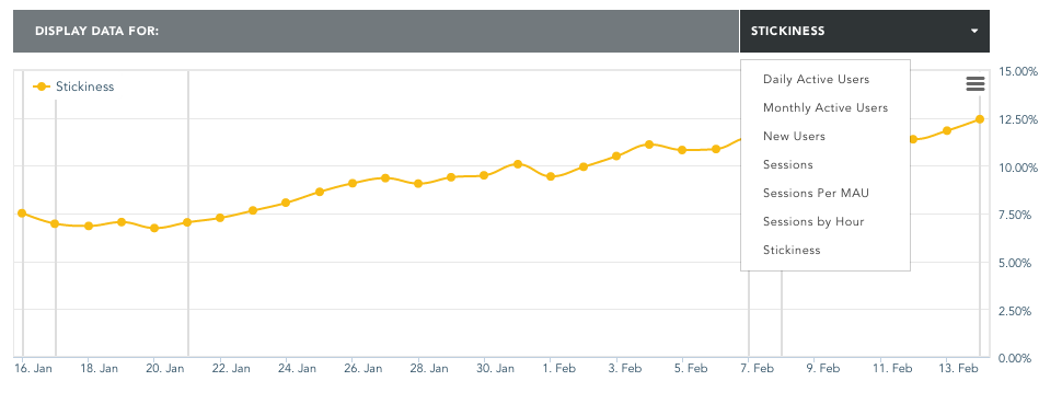
- Brand new KPIs, including Daily Active Users (DAUs), Stickiness (DAU/MAU) and Average Daily Sessions
- KPI trends and comparisons with past time periods
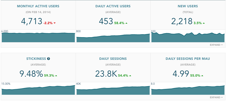
- Analytics in custom time ranges
- Brand new KPIs, including Stickiness
- Industry-first analytics by segment
The new page offers plenty of beneficial changes. Here’s a quick guide to find your way around the page, from top to bottom:
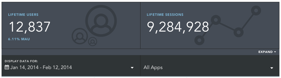
- Lifetime app stats
- App analytics with fully customizable time ranges
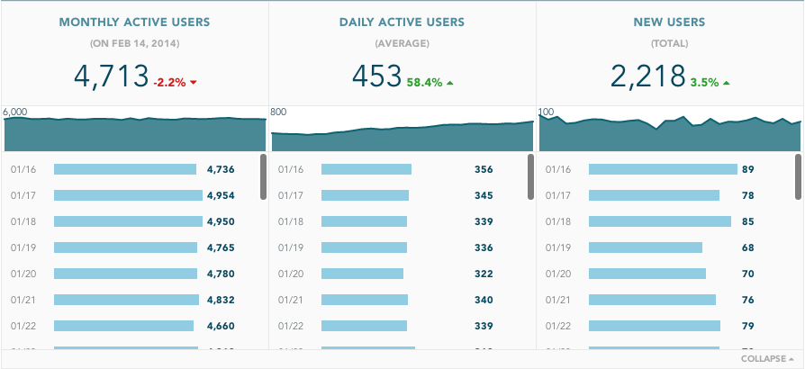
- Tabular data to dig deeper into the numbers
- Analytics by segment
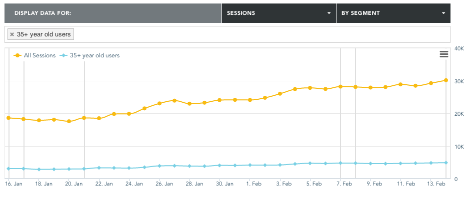
- Time-series analytics for all KPIs
The updated page will be available Friday and include historical data for all stats.
Be Absolutely Engaging.™
Sign up for regular updates from Braze.