Insight into the New Visual Dashboard Update
Published on December 19, 2014/Last edited on December 19, 2014/1 min read

Team Braze
Just in time for the holidays, we’ve launched updated visual wrapping for the Appboy dashboard. As one of the visual designers here, I thought it would be helpful to walk through some of the changes.
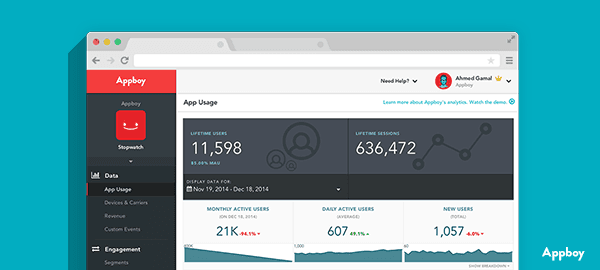
The new look might not have a major impact on functionality, but we’d like to think that it does improve the user experience.
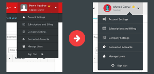
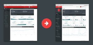
We made the UI design more current with curved corners, an upgraded color palette and flat design. We also changed the color of the menu bar, switching from red to grey to be more visually pleasing and less arresting.
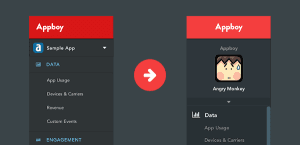
While branding is important, our clients are paramount, so in subtle ways we made the dashboard’s appearance less about the company and more about the customer. We’re constantly thinking of ways to try and improve performance, and in this iteration we addressed the collapsing sidebar, and made it permanently present. As a result, this will hopefully help your experience remain consistent and familiar, with everything you need in sight. If you have any questions about the new look, don’t hesitate to email [email protected].
Be Absolutely Engaging.™
Sign up for regular updates from Braze.
Related Content
View the Blog
How Android 16 and iOS 26 are reshaping customer engagement

Haley Trost

Proven customer retention strategies for building loyalty and reducing churn
July 02, 2025
Introducing OfferFit by Braze: Answering burning questions