In-app message style settings
The drag-and-drop editing experience is divided into two sections: Build and Preview & Test. This article covers what you need to know for working within the Build tab of the editor and assumes you’ve already created an in-app message.
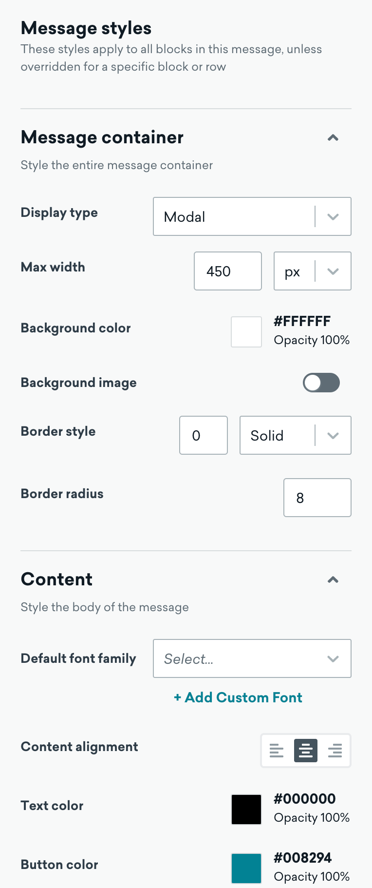
Message-level styles
You can set certain styles to be applied across all relevant blocks in your in-app message from the Message Styles tab. For example, you may want to customize the font of all the text or the color of all links in your message.
The styles in this section are used everywhere in your message except where you override it for a specific block. If your message has multiple pages, you can also override the message-level styles for individual pages, except for display type and max width.
For an easier design experience, we recommend setting up message-level styles before you customize styles at the block level.
To return to the Message Styles tab at any time:
- Click the close X button on individual block properties
- Select the message container, message close X button, or editor background
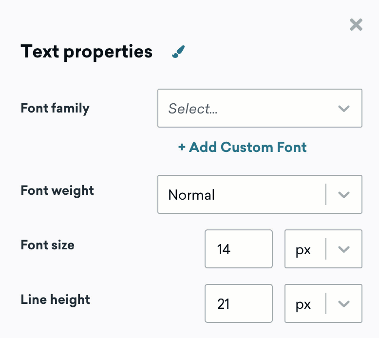
Custom fonts
We accept the following file types for fonts: .ttf, .woff, .otf, and .woff2. For more information, see Asset files.
You can add multiple variations of a font family, as some styling options may not be available for custom fonts. Currently, we don’t support adding fonts via URL.
To add a custom font:
- Go to the Content section in the Message styles tab.
- Click Add custom font.
- Upload your font using the media library.
The message-level font will only apply to the current message and any duplicated messages, but not to future templates.
Message components
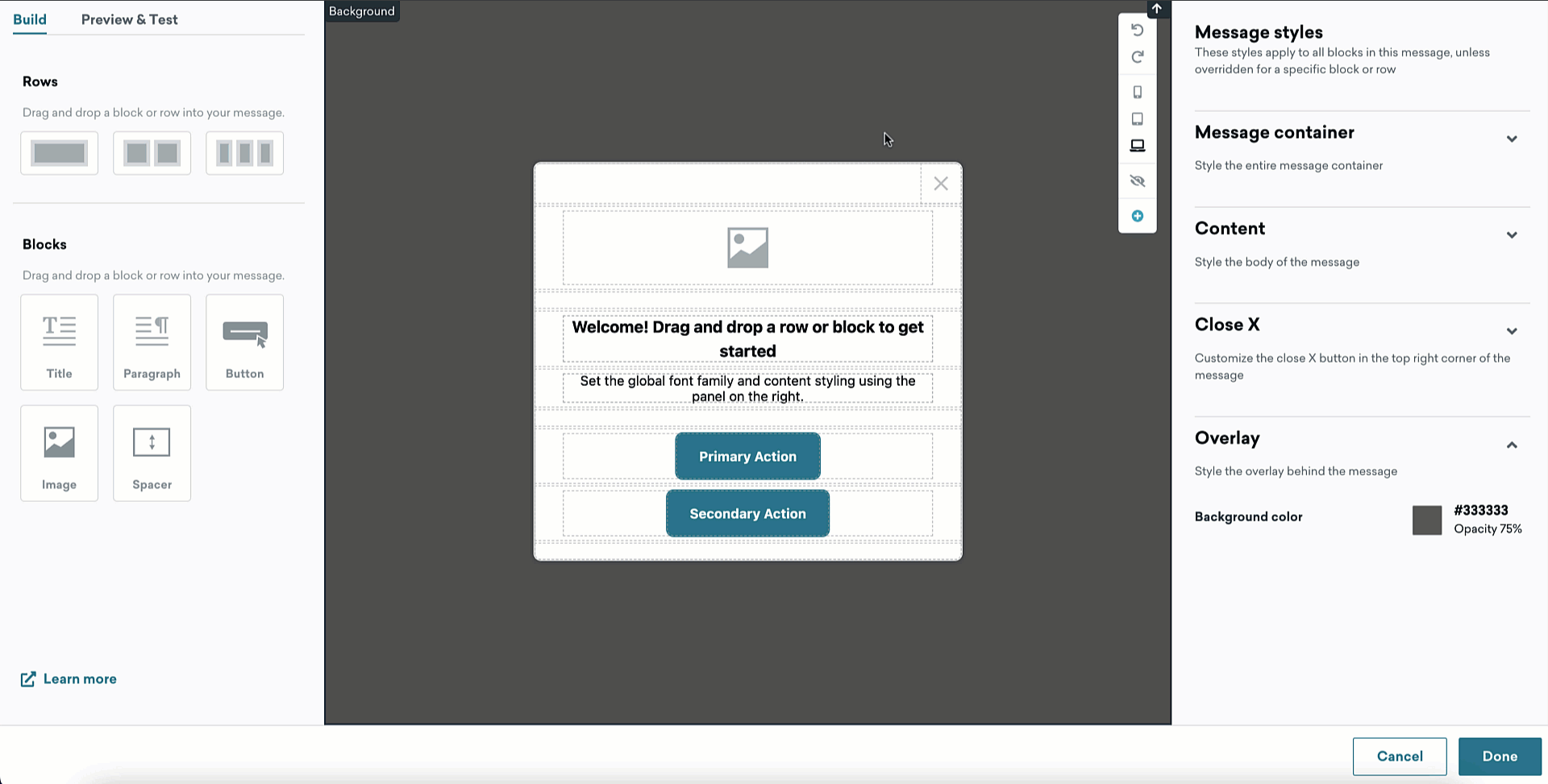
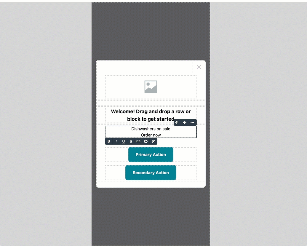
The drag-and-drop editor uses two key components for composing in-app messages: rows and blocks. All blocks must be placed in a row.
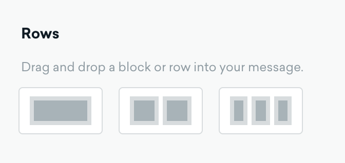
Rows
Rows are structural units that define the horizontal composition of a section of the message by using cells.
When a row is selected, you can add or remove the number of columns you need from the Column customization section to put different content elements side by side.
You can also slide to adjust the size of existing columns.
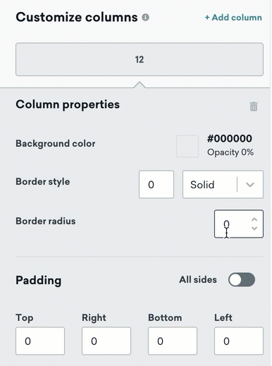
As a best practice, format your row and column properties before formatting any of the blocks inside the rows. There are many places where you can adjust the spacing and alignment, so starting from the foundation makes it easier to edit as you go.
Blocks
Blocks represent different types of content you can use in your message. Drag one inside an existing row segment, and it will auto-adjust to the cell width.
Before you add blocks, set up message-level styles for the message container, font, colors, and anything else you want to customize. You can then customize individual blocks as needed. The Close Button will remain at the top section of your message so that users always have the option to dismiss the message.
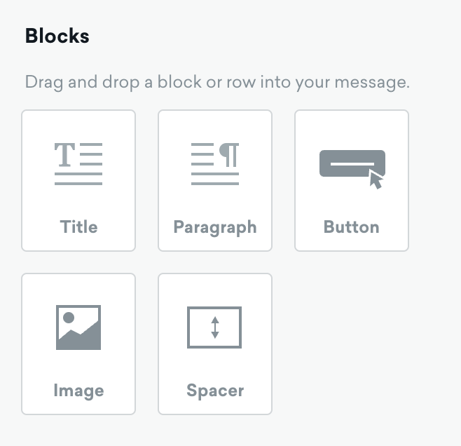
Every block has its settings, such as granular control on padding. The right-side panel automatically switches to a styling panel for the selected content element. For more information, see Editor block properties.
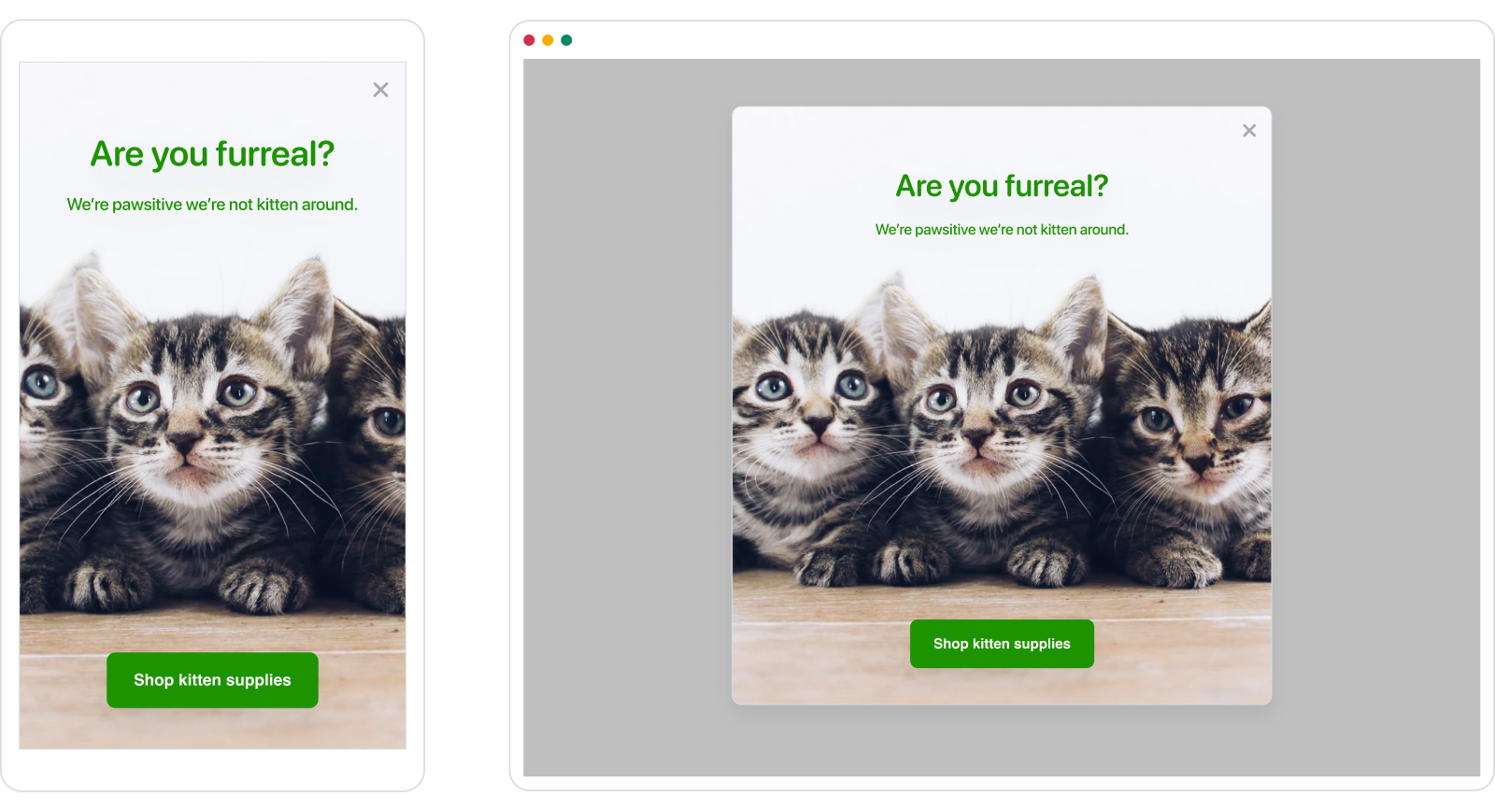
As you build your in-app message, you can select a mobile, tablet, or desktop view in the toolbar to preview how your in-app message will look for your user groups. This will ensure that your content is responsive, and you can make any necessary adjustments along the way.
Creative details
Fullscreen on larger screens
On a tablet or desktop browser, a fullscreen in-app message will sit in the center of the app screen. Any edits to the max width of the fullscreen message will only apply to tablet and desktop devices.
Customize background image
You can add an image to the background of your message from the Message styles tab. The scrollable section of your message must be selected to add a background for the entire message.
If you’re having trouble selecting a certain block, you can use the up arrow in the block’s inline toolbar to move focus up to each parent block.
Adding Liquid
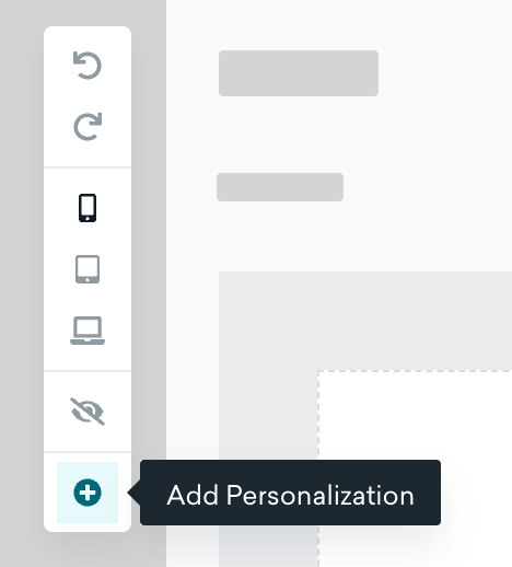
To add Liquid into your in-app message, select Add Personalization from the editor toolbar. Here, you can add various personalization types such as default attributes, device attributes, custom attributes, and more.
Next, take your generated Liquid snippet and insert it into your message. After designing and building your in-app message, go to Preview & Test to preview your message.
Using the AI copywriter
When a text block is selected in your in-app message, click in the block toolbar to launch the AI-powered copywriting assistant. The AI copywriting assistant passes a brief product name or description to OpenAI’s GPT3 copy generation tool to generate human-like marketing copy for your messaging.
You can save a few clicks by highlighting text inside the block before clicking the icon. The highlighted text will be added to the tool, and copy will be generated immediately.
Resetting styles to default
Properties that you have changed from their default styling are marked with an orange dot. To reset a specific property to its default style, hover over the field and select Reset to default.
You can also reset all styling for a selected element by selecting the next to the properties panel name and selecting Reset to default styles.
Copying and pasting styles
After making changes to the styling of an element, you can copy and paste those styles to another element. When pasting styles, only the properties relevant to that element are applied.
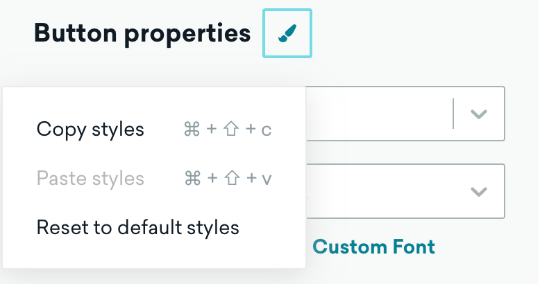
- With the element selected, select next to the properties panel name (For example, if you have a button selected, next to “Button properties”).
- Click Copy styles and select the element where you would like to apply the copied style.
- Select again and choose Paste styles.
Keyboard shortcuts
You can also use keyboard shortcuts to copy and paste styles:
| Action | Mac | Windows |
|---|---|---|
| Copy styles | ⌘ + Shift + c | Ctrl + Shift + c |
| Paste styles | ⌘ + Shift + v | Ctrl + Shift + v |
 Edit this page on GitHub