Content Cards 스타일 커스터마이즈
Braze Content Cards에는 기본 모양과 느낌이 제공됩니다. 이 문서에서는 브랜드 아이덴티티에 맞게 Content Cards의 스타일을 지정하는 옵션을 다룹니다. 콘텐츠 카드 유형의 전체 목록은 Content Cards 정보를 참조하세요.
커스텀 스타일 만들기
기본 Content Cards UI는 Braze SDK의 UI 레이어에서 가져옵니다. 이를 통해 카드 스타일의 특정 부분, 카드가 표시되는 순서, 피드가 사용자에게 표시되는 방식을 조정할 수 있습니다.
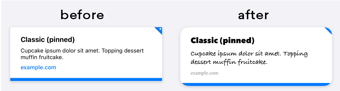

title, cardDescription, imageUrl 등과 같은 Content Cards 속성은 대시보드를 통해 직접 편집할 수 있으며, 이러한 세부 정보를 변경하려면 이 방법을 사용하는 것이 좋습니다.
Braze의 기본 스타일은 Braze SDK 내 CSS에 정의되어 있습니다. 애플리케이션에서 선택한 스타일을 오버라이드하면 배경 이미지, 글꼴 패밀리, 스타일, 크기, 애니메이션 등을 사용하여 표준 피드를 커스터마이즈할 수 있습니다. 예를 들어, 다음은 Content Cards가 800px 너비로 표시되도록 하는 오버라이드 예시입니다:
body .ab-feed {
width: 800px;
}
수정할 수 있는 속성의 전체 목록은 Braze의 SDK 구성 옵션을 참조하세요.
기본적으로 Android 및 FireOS SDK Content Cards는 표준 Android UI 가이드라인을 따라 원활한 경험을 제공합니다. 이러한 기본 스타일은 Braze SDK 배포의 res/values/styles.xml 파일에서 확인할 수 있습니다:
<style name="Braze.ContentCards.CaptionedImage.Description">
<item name="android:textColor">@color/com_braze_description</item>
<item name="android:textSize">15.0sp</item>
<item name="android:includeFontPadding">false</item>
<item name="android:paddingBottom">8.0dp</item>
<item name="android:layout_marginLeft">10.0dp</item>
<item name="android:layout_marginRight">10.0dp</item>
<item name="android:layout_marginTop">8.0dp</item>
<item name="android:layout_width">match_parent</item>
<item name="android:layout_below">@id/com_braze_content_cards_captioned_image_card_title_container</item>
</style>
Content Cards 스타일을 커스터마이즈하려면 이 기본 스타일을 오버라이드하세요. 스타일을 오버라이드하려면 전체 스타일을 프로젝트의 styles.xml 파일에 복사하고 수정합니다. 모든 속성이 올바르게 설정되려면 전체 스타일을 로컬 styles.xml 파일에 복사해야 합니다.
<style name="Braze.ContentCardsDisplay">
<item name="android:background">@color/mint</item>
<item name="android:cacheColorHint">@color/mint</item>
<item name="android:divider">@android:color/transparent</item>
<item name="android:dividerHeight">16.0dp</item>
<item name="android:paddingLeft">12.5dp</item>
<item name="android:paddingRight">5.0dp</item>
<item name="android:scrollbarStyle">outsideInset</item>
</style>
<style name="Braze.ContentCardsDisplay">
<item name="android:background">@color/mint</item>
<item name="android:cacheColorHint">@color/mint</item>
</style>
기본적으로 Android 및 FireOS SDK Content Cards는 표준 Android UI 가이드라인을 따라 원활한 경험을 제공합니다.
스타일링을 적용하는 방법은 두 가지입니다. 첫 번째는 다음 예시처럼 ContentCardListStyling과 ContentCardStyling을 ContentCardsList에 전달하는 것입니다:
ContentCardsList(
style = ContentCardListStyling(listBackgroundColor = Color.Red),
cardStyle = ContentCardStyling(
titleTextStyle = TextStyle(
fontFamily = fontFamily,
fontSize = 25.sp
),
shadowRadius = 10.dp,
shortNewsContentCardStyle = BrazeShortNewsContentCardStyling(
shadowRadius = 15.dp
)
)
)
두 번째는 다음 예시처럼 BrazeStyle을 사용하여 Braze 컴포넌트에 대한 전역 스타일링을 만드는 것입니다:
BrazeStyle(
contentCardStyle = ContentCardStyling(
textAnnouncementContentCardStyle = BrazeTextAnnouncementContentCardStyling(
cardBackgroundColor = Color.Red,
descriptionTextStyle = TextStyle(
fontFamily = fontFamily,
fontSize = 25.sp,
)
),
titleTextColor = Color.Magenta
)
) {
// Your app here, including any ContentCardsList() in it
}
Content Cards 뷰 컨트롤러를 사용하면 BrazeContentCardUI.ViewController.Attributes 구조체를 통해 모든 셀의 외관과 동작을 커스터마이즈할 수 있습니다. Attributes를 사용하여 Content Cards를 구성하면 최소한의 설정으로 Content Cards UI를 쉽게 실행할 수 있습니다.

Attributes를 통한 커스터마이즈는 Swift에서만 사용할 수 있습니다.
Attributes.default 수정하기
정적 Attributes.defaults 변수를 직접 수정하여 Braze Content Cards UI 뷰 컨트롤러의 모든 인스턴스의 외관과 느낌을 커스터마이즈할 수 있습니다.
예를 들어, 모든 셀의 기본 이미지 크기와 모서리 반경을 변경하려면:
BrazeContentCardUI.ViewController.Attributes.defaults.cellAttributes.cornerRadius = 20
BrazeContentCardUI.ViewController.Attributes.defaults.cellAttributes.classicImageSize = CGSize(width: 65, height: 65)
Attributes로 뷰 컨트롤러 초기화하기
Braze Content Cards UI 뷰 컨트롤러의 특정 인스턴스만 수정하려는 경우, init(braze:attributes:) 이니셜라이저를 사용하여 커스텀 Attributes 구조체를 뷰 컨트롤러에 전달합니다.
예를 들어, 뷰 컨트롤러의 특정 인스턴스에 대해 이미지 크기와 모서리 반경을 변경할 수 있습니다:
var attributes = BrazeContentCardUI.ViewController.Attributes.defaults
attributes.cellAttributes.cornerRadius = 20
attributes.cellAttributes.classicImageSize = CGSize(width: 65, height: 65)
let viewController = BrazeContentCardUI.ViewController(braze: AppDelegate.braze, attributes: attributes)
서브클래싱으로 셀 커스터마이즈하기
또는 원하는 각 카드 유형에 대해 커스텀 클래스를 등록하여 커스텀 인터페이스를 만들 수 있습니다. 기본 셀 대신 서브클래스를 사용하려면 Attributes 구조체에서 cells 속성을 수정합니다. 예를 들어:
var attributes = BrazeContentCardUI.ViewController.Attributes.defaults
// Register your own custom cell
attributes.cells[BrazeContentCardUI.ClassicImageCell.identifier] = CustomClassicImageCell.self
let viewController = BrazeContentCardUI.ViewController(braze: AppDelegate.braze, attributes: attributes)
프로그래밍 방식으로 Content Cards 수정하기
Attributes 구조체의 transform 클로저를 할당하여 프로그래밍 방식으로 Content Cards를 변경할 수 있습니다. 다음 예시는 호환되는 카드의 title과 description을 수정합니다:
var attributes = BrazeContentCardUI.ViewController.Attributes.defaults
attributes.transform = { cards in
cards.map { card in
var card = card
if let title = card.title {
card.title = "[modified] \(title)"
}
if let description = card.description {
card.description = "[modified] \(description)"
}
return card
}
}
let viewController = BrazeContentCardUI.ViewController(braze: AppDelegate.braze, attributes: attributes)
전체 예시는 Examples 샘플 앱을 참조하세요.
Objective-C에서는 Attributes를 통한 Content Cards 커스터마이즈가 지원되지 않습니다.
커스터마이징 예제
커스텀 글꼴
Content Cards에 사용되는 글꼴을 커스터마이징하면 브랜드 정체성을 유지하고 사용자에게 시각적으로 매력적인 경험을 제공할 수 있습니다. 다음 레시피를 사용하여 모든 Content Cards의 글꼴을 프로그래밍 방식으로 설정하세요.
다른 웹 요소와 마찬가지로 CSS를 통해 Content Cards의 외관을 쉽게 커스터마이징할 수 있습니다. CSS 파일이나 인라인 스타일에서 font-family 속성을 사용하고 원하는 글꼴 이름 또는 글꼴 스택을 지정합니다.
/* CSS selector targeting the Content Card element */
.card-element {
font-family: "Helvetica Neue", Arial, sans-serif;
}
기본 글꼴을 프로그래밍 방식으로 변경하려면 카드에 스타일을 설정하고 fontFamily 속성을 사용하여 Braze에 커스텀 글꼴 패밀리를 사용하도록 지시합니다.
예를 들어, 캡션 이미지 카드의 모든 제목에 대한 글꼴을 업데이트하려면 Braze.ContentCards.CaptionedImage.Title 스타일을 오버라이드하고 커스텀 글꼴 패밀리를 참조하세요. 속성 값은 res/font 디렉터리에 있는 글꼴 패밀리를 가리켜야 합니다.
다음은 마지막 줄에서 커스텀 글꼴 패밀리 my_custom_font_family를 참조하는 축약된 예제입니다:
<style name="Braze.ContentCards.CaptionedImage.Title">
<item name="android:layout_width">wrap_content</item>
...
<item name="android:fontFamily">@font/my_custom_font_family</item>
<item name="fontFamily">@font/my_custom_font_family</item>
</style>
위의 XML 예제는 카드 스타일에서 커스텀 글꼴 패밀리를 참조하는 방법을 보여줍니다.
기본 글꼴을 프로그래밍 방식으로 변경하려면 ContentCardStyling의 titleTextStyle을 설정할 수 있습니다.
특정 카드 유형에 대해 titleTextStyle을 설정하려면 BrazeShortNewsContentCardStyling에서 설정한 후 ContentCardStyling의 shortNewsContentCardStyle에 전달할 수도 있습니다.
val fontFamily = FontFamily(
Font(R.font.sailec_bold)
)
ContentCardStyling(
titleTextStyle = TextStyle(
fontFamily = fontFamily
)
)
cellAttributes 인스턴스 속성의 Attributes를 커스터마이징하여 글꼴을 커스터마이징하세요. 예:
var attributes = BrazeContentCardUI.ViewController.Attributes.defaults
attributes.cellAttributes.titleFont = .preferredFont(textStyle: .callout, weight: .bold)
attributes.cellAttributes.descriptionFont = .preferredFont(textStyle: .footnote, weight: .regular)
attributes.cellAttributes.domainFont = .preferredFont(textStyle: .footnote, weight: .medium)
let viewController = BrazeContentCardUI.ViewController.init(braze: braze, attributes: attributes)
Attributes를 통한 글꼴 커스터마이징은 Objective-C에서 지원되지 않습니다.
커스텀 글꼴로 자체 UI를 빌드하는 예제는 Examples 샘플 앱을 확인하세요.
커스텀 고정 아이콘
Content Cards를 생성할 때 마케터는 카드를 고정할 수 있는 옵션이 있습니다. 고정 카드는 사용자 피드 상단에 표시되며 사용자가 해제할 수 없습니다. 카드 스타일을 커스터마이징할 때 고정 아이콘의 모양을 변경할 수 있습니다.
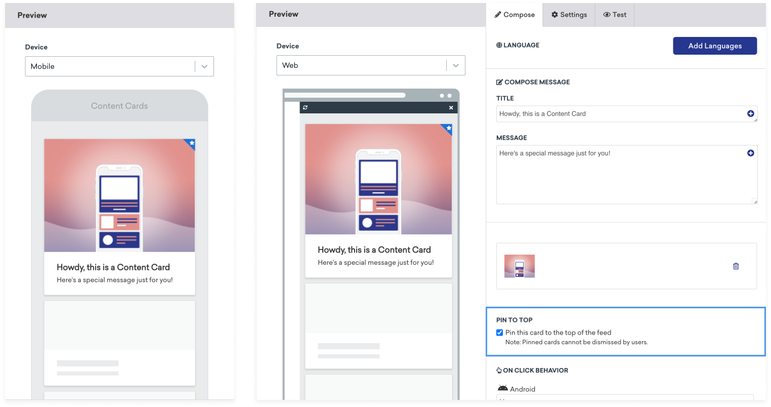
Content Cards 고정 아이콘의 구조는 다음과 같습니다:
<div class="ab-pinned-indicator">
<i class="fa fa-star"></i>
</div>
다른 FontAwesome 아이콘을 사용하려면 i 요소의 클래스 이름을 원하는 아이콘의 클래스 이름으로 교체하세요.
아이콘을 완전히 바꾸려면 i 요소를 제거하고 커스텀 아이콘을 ab-pinned-indicator의 자식으로 추가하세요. 아이콘을 변경하는 여러 방법이 있지만, 간단한 방법 중 하나는 ab-pinned-indicator 요소에서 replaceChildren()을 사용하는 것입니다.
예:
// Get the parent element
const pinnedIndicator = document.querySelector('.ab-pinned-indicator');
// Create a new custom icon element
const customIcon = document.createElement('span');
customIcon.classList.add('customIcon');
// Replace the existing icon with the custom icon
pinnedIndicator.replaceChildren(customIcon);
커스텀 고정 아이콘을 설정하려면 Braze.ContentCards.PinnedIcon 스타일을 오버라이드하세요. 커스텀 이미지 에셋은 android:src 요소에서 선언해야 합니다. 예:
<style name="Braze.ContentCards.PinnedIcon">
<item name="android:src">@drawable/{my_custom_image_here}</item>
<item name="android:layout_width">wrap_content</item>
<item name="android:layout_height">wrap_content</item>
<item name="android:layout_alignParentRight">true</item>
<item name="android:layout_alignParentTop">true</item>
<item name="android:contentDescription">@null</item>
<item name="android:importantForAccessibility">no</item>
</style>
기본 고정 아이콘을 변경하려면 ContentCardStyling의 pinnedResourceId를 설정할 수 있습니다. 예:
ContentCardStyling(
pinnedResourceId = R.drawable.pushpin,
pinnedImageAlignment = Alignment.TopCenter
)
ContentCardStyling의 pinnedComposable에 Composable을 지정할 수도 있습니다. pinnedComposable이 지정되면 pinnedResourceId 값을 오버라이드합니다.
ContentCardStyling(
pinnedComposable = {
Box(Modifier.fillMaxWidth()) {
Text(
modifier = Modifier
.align(Alignment.Center)
.width(50.dp),
text = "This message is not read. Please read it."
)
}
}
)
cellAttributes 인스턴스 속성의 pinIndicatorColor 및 pinIndicatorImage 속성을 수정하여 고정 아이콘을 커스터마이징하세요. 예:
var attributes = BrazeContentCardUI.ViewController.Attributes.defaults
attributes.cellAttributes.pinIndicatorColor = .red
attributes.cellAttributes.pinIndicatorImage = UIImage(named: "my-image")
let viewController = BrazeContentCardUI.ViewController.init(braze: braze, attributes: attributes)
서브클래싱을 사용하여 고정 표시기를 포함하는 BrazeContentCardUI.Cell의 커스텀 버전을 만들 수도 있습니다. 예:
var attributes = BrazeContentCardUI.ViewController.Attributes.defaults
attributes.cells[BrazeContentCardUI.ClassicImageCell.identifier] = CustomClassicImageCell.self
let viewController = BrazeContentCardUI.ViewController(braze: AppDelegate.braze, attributes: attributes)
Attributes를 통한 고정 표시기 커스터마이징은 Objective-C에서 지원되지 않습니다.
읽지 않음 표시기 색상 변경
Content Cards에는 카드 하단에 파란색 선이 포함되어 있으며, 이 선은 카드가 조회되었는지 여부를 나타냅니다.
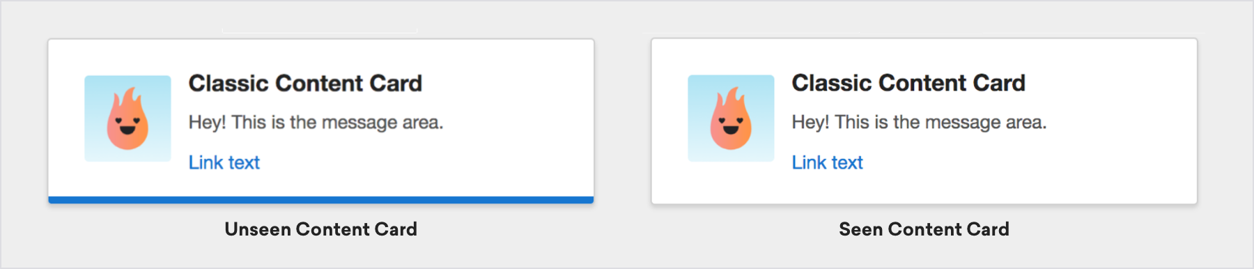
카드의 읽지 않음 표시기 색상을 변경하려면 웹페이지에 커스텀 CSS를 추가하세요. 예를 들어, 미확인 표시기 색상을 녹색으로 설정하려면:
.ab-unread-indicator { background-color: green; }
colors.xml 파일에서 com_braze_content_cards_unread_bar_color의 값을 변경하여 읽지 않음 표시기 막대의 색상을 변경하세요:
<?xml version="1.0" encoding="utf-8"?>
<resources>
<!-- The color used to highlight unread Content Cards at their bottom edge -->
<color name="com_braze_content_cards_unread_bar_color">#1676d0</color>
</resources>
읽지 않음 표시기 막대의 색상을 변경하려면 ContentCardStyling에서 unreadIndicatorColor의 값을 수정하세요:
ContentCardStyling(
unreadIndicatorColor = Color.Red
)
BrazeContentCardUI.ViewController 인스턴스의 틴트 색상에 값을 할당하여 읽지 않음 표시기 막대의 색상을 변경하세요:
let viewController = BrazeContentCardUI.ViewController(braze: AppDelegate.braze)
viewController.view.tintColor = .systemGreen
그러나 미확인 표시기만 수정하려면 BrazeContentCardUI.ViewController.Attributes 구조체의 unviewedIndicatorColor 속성에 접근할 수 있습니다. Braze UITableViewCell 구현을 사용하는 경우 셀이 그려지기 전에 속성에 접근하세요.
예를 들어, 미확인 표시기 색상을 빨간색으로 설정하려면:
var attributes = BrazeContentCardUI.ViewController.Attributes.defaults
attributes.cellAttributes.unviewedIndicatorColor = .red
let viewController = BrazeContentCardUI.ViewController(braze: AppDelegate.braze, attributes: attributes)
전체 예제는 Examples 샘플 앱을 확인하세요.
BRZContentCardUIViewController의 틴트 색상에 값을 할당하여 읽지 않음 표시기 막대의 색상을 변경하세요:
BRZContentCardUIViewController *viewController = [[BRZContentCardUIViewController alloc] initWithBraze:AppDelegate.braze];
[viewController.view setTintColor:[UIColor systemGreenColor]];
Attributes를 통한 미확인 표시기만의 커스터마이징은 Objective-C에서 지원되지 않습니다.
다크 모드
기기의 다크 모드 또는 라이트 모드에 따라 다른 이미지 또는 스타일을 표시하려면 Content Cards 메시지에서 키-값 페어를 사용하세요. 예를 들어 다크 모드 이미지 에셋의 URL과 함께 dark_mode_image와 같은 키-값 페어를 추가합니다. 그런 다음 앱에서 기기의 현재 외관 모드를 확인하고 적절한 이미지를 표시하는 커스텀 로직을 추가하세요.
if let darkImageUrl = card.extras["dark_mode_image"],
view.traitCollection.userInterfaceStyle == .dark {
// Use darkImageUrl for the image
}
val darkModeImage = card.extras["dark_mode_image"]
val isDarkMode = (resources.configuration.uiMode and Configuration.UI_MODE_NIGHT_MASK) == Configuration.UI_MODE_NIGHT_YES
if (isDarkMode && darkModeImage != null) {
// Use darkModeImage for the image
}
const darkModeImage = card.extras?.dark_mode_image;
const isDarkMode = window.matchMedia("(prefers-color-scheme: dark)").matches;
if (isDarkMode && darkModeImage) {
// Use darkModeImage for the image
}
이 패턴은 텍스트, 색상 또는 레이아웃을 포함하여 외관에 따라 달라지는 모든 콘텐츠에 사용할 수 있습니다. 다크 모드 이미지 에셋을 미디어 라이브러리에 업로드한 후 키-값 페어에서 참조하세요.
읽지 않음 표시기 비활성화
css에 다음 스타일을 추가하여 읽지 않음 표시기 막대를 숨기세요:
.ab-unread-indicator { display: none; }
ContentCardViewHolder에서 setUnreadBarVisible을 false로 설정하여 읽지 않음 표시기 막대를 숨기세요.
Jetpack Compose에서는 읽지 않음 표시기 비활성화가 지원되지 않습니다.
Attributes 구조체에서 attributes.cellAttributes.unviewedIndicatorColor 속성을 .clear로 설정하여 읽지 않음 표시기 막대를 숨기세요.
Attributes를 통한 미확인 표시기만의 커스터마이징은 Objective-C에서 지원되지 않습니다.