Content Cardsのスタイルをカスタマイズする
Braze Content Cardsには、デフォルトのルックアンドフィールが含まれています。この記事では、ブランドアイデンティティに合わせるためのContent Cardsのスタイルオプションについて説明します。コンテンツカードタイプの完全なリストについては、Content Cardsについてを参照してください。
カスタムスタイルの作成
デフォルトのContent Cards UIは、Braze SDKのUIレイヤーからインポートされます。そこから、カードのスタイリングの特定の部分、カードの表示順序、フィードがユーザーにどのように表示されるかを調整できます。
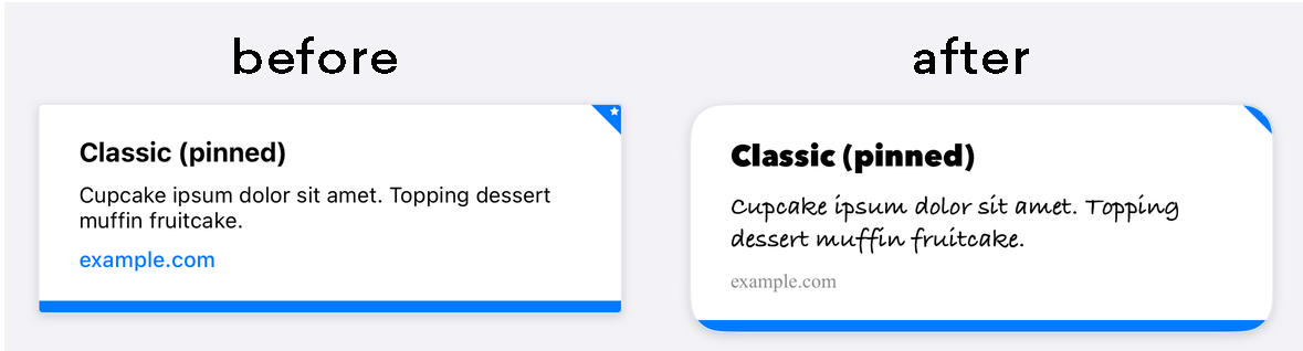

title、cardDescription、imageUrlなどのContent Cardsプロパティは、ダッシュボードから直接編集できます。これらの詳細を変更するには、ダッシュボードを使用する方法が推奨されます。
Brazeのデフォルトスタイルは、Braze SDK内のCSSで定義されています。アプリケーションで選択したスタイルをオーバーライドすることで、独自の背景画像、フォントファミリー、スタイル、サイズ、アニメーションなどを使用して標準フィードをカスタマイズできます。たとえば、以下はContent Cardsの幅を800pxに設定するオーバーライドの例です。
body .ab-feed {
width: 800px;
}
変更可能なプロパティの完全なリストについては、BrazeのSDK設定オプションを参照してください。
デフォルトでは、AndroidおよびFireOS SDKのContent Cardsは標準のAndroid UIガイドラインに準拠し、シームレスなエクスペリエンスを提供します。これらのデフォルトスタイルは、Braze SDKディストリビューションのres/values/styles.xmlファイルで確認できます。
<style name="Braze.ContentCards.CaptionedImage.Description">
<item name="android:textColor">@color/com_braze_description</item>
<item name="android:textSize">15.0sp</item>
<item name="android:includeFontPadding">false</item>
<item name="android:paddingBottom">8.0dp</item>
<item name="android:layout_marginLeft">10.0dp</item>
<item name="android:layout_marginRight">10.0dp</item>
<item name="android:layout_marginTop">8.0dp</item>
<item name="android:layout_width">match_parent</item>
<item name="android:layout_below">@id/com_braze_content_cards_captioned_image_card_title_container</item>
</style>
Content Cardsのスタイリングをカスタマイズするには、このデフォルトスタイルをオーバーライドします。スタイルをオーバーライドするには、プロジェクトのstyles.xmlファイルにスタイルをすべてコピーし、変更を加えます。すべての属性が正しく設定されるようにするため、スタイル全体をローカルのstyles.xmlファイルにコピーする必要があります。
<style name="Braze.ContentCardsDisplay">
<item name="android:background">@color/mint</item>
<item name="android:cacheColorHint">@color/mint</item>
<item name="android:divider">@android:color/transparent</item>
<item name="android:dividerHeight">16.0dp</item>
<item name="android:paddingLeft">12.5dp</item>
<item name="android:paddingRight">5.0dp</item>
<item name="android:scrollbarStyle">outsideInset</item>
</style>
<style name="Braze.ContentCardsDisplay">
<item name="android:background">@color/mint</item>
<item name="android:cacheColorHint">@color/mint</item>
</style>
デフォルトでは、AndroidおよびFireOS SDKのContent Cardsは標準のAndroid UIガイドラインに準拠し、シームレスなエクスペリエンスを提供します。
スタイリングを適用する方法は2つあります。1つ目は、以下の例のようにContentCardListStylingとContentCardStylingをContentCardsListに渡す方法です。
ContentCardsList(
style = ContentCardListStyling(listBackgroundColor = Color.Red),
cardStyle = ContentCardStyling(
titleTextStyle = TextStyle(
fontFamily = fontFamily,
fontSize = 25.sp
),
shadowRadius = 10.dp,
shortNewsContentCardStyle = BrazeShortNewsContentCardStyling(
shadowRadius = 15.dp
)
)
)
2つ目は、以下の例のようにBrazeStyleを使用してBrazeコンポーネントにグローバルスタイリングを作成する方法です。
BrazeStyle(
contentCardStyle = ContentCardStyling(
textAnnouncementContentCardStyle = BrazeTextAnnouncementContentCardStyling(
cardBackgroundColor = Color.Red,
descriptionTextStyle = TextStyle(
fontFamily = fontFamily,
fontSize = 25.sp,
)
),
titleTextColor = Color.Magenta
)
) {
// Your app here, including any ContentCardsList() in it
}
Content Cardsビューコントローラーでは、BrazeContentCardUI.ViewController.Attributes構造体を使用して、すべてのセルの外観と動作をカスタマイズできます。Attributesを使用したContent Cardsの設定は簡単なオプションで、最小限のセットアップでContent Cards UIを起動できます。

AttributesによるカスタマイズはSwiftでのみ利用可能です。
Attributes.defaultの変更
静的なAttributes.defaults変数を直接変更することで、Braze Content Cards UIビューコントローラーのすべてのインスタンスのルックアンドフィールをカスタマイズできます。
たとえば、すべてのセルのデフォルトの画像サイズと角の半径を変更するには、以下のようにします。
BrazeContentCardUI.ViewController.Attributes.defaults.cellAttributes.cornerRadius = 20
BrazeContentCardUI.ViewController.Attributes.defaults.cellAttributes.classicImageSize = CGSize(width: 65, height: 65)
Attributesを使用したビューコントローラーの初期化
Braze Content Cards UIビューコントローラーの特定のインスタンスのみを変更する場合は、init(braze:attributes:)イニシャライザーを使用して、カスタムのAttributes構造体をビューコントローラーに渡します。
たとえば、ビューコントローラーの特定のインスタンスの画像サイズと角の半径を変更できます。
var attributes = BrazeContentCardUI.ViewController.Attributes.defaults
attributes.cellAttributes.cornerRadius = 20
attributes.cellAttributes.classicImageSize = CGSize(width: 65, height: 65)
let viewController = BrazeContentCardUI.ViewController(braze: AppDelegate.braze, attributes: attributes)
サブクラス化によるセルのカスタマイズ
あるいは、目的のカードタイプごとにカスタムクラスを登録してカスタムインターフェイスを作成することもできます。デフォルトのセルの代わりにサブクラスを使用するには、Attributes構造体のcellsプロパティを変更します。例:
var attributes = BrazeContentCardUI.ViewController.Attributes.defaults
// Register your own custom cell
attributes.cells[BrazeContentCardUI.ClassicImageCell.identifier] = CustomClassicImageCell.self
let viewController = BrazeContentCardUI.ViewController(braze: AppDelegate.braze, attributes: attributes)
Content Cardsをプログラムで変更する
Attributes構造体のtransformクロージャを割り当てることで、Content Cardsをプログラムで変更できます。以下の例では、互換性のあるカードのtitleとdescriptionを変更しています。
var attributes = BrazeContentCardUI.ViewController.Attributes.defaults
attributes.transform = { cards in
cards.map { card in
var card = card
if let title = card.title {
card.title = "[modified] \(title)"
}
if let description = card.description {
card.description = "[modified] \(description)"
}
return card
}
}
let viewController = BrazeContentCardUI.ViewController(braze: AppDelegate.braze, attributes: attributes)
完全な例については、Examplesサンプルアプリをご確認ください。
AttributesによるContent Cardsのカスタマイズは、Objective-Cではサポートされていません。
カスタマイズの例
カスタムフォント
Content Cardsで使用するフォントをカスタマイズすることで、ブランドアイデンティティを維持し、ユーザーにとって視覚的に魅力的なエクスペリエンスを作成できます。以下のレシピを使用して、すべてのContent Cardsのフォントをプログラムで設定してください。
他のWeb要素と同様に、CSSを使用してContent Cardsの外観を簡単にカスタマイズできます。CSSファイルまたはインラインスタイルで、font-family プロパティを使用して、目的のフォント名またはフォントスタックを指定します。
/* CSS selector targeting the Content Card element */
.card-element {
font-family: "Helvetica Neue", Arial, sans-serif;
}
デフォルトのフォントをプログラムで変更するには、カードのスタイルを設定し、fontFamily 属性を使用してカスタムフォントファミリーを使用するようBrazeに指示します。
たとえば、キャプション付き画像カードのすべてのタイトルのフォントを更新するには、Braze.ContentCards.CaptionedImage.Title スタイルをオーバーライドし、カスタムフォントファミリーを参照します。属性値は res/font ディレクトリ内のフォントファミリーを指す必要があります。
以下は、最終行でカスタムフォントファミリー my_custom_font_family を参照した省略例です。
<style name="Braze.ContentCards.CaptionedImage.Title">
<item name="android:layout_width">wrap_content</item>
...
<item name="android:fontFamily">@font/my_custom_font_family</item>
<item name="fontFamily">@font/my_custom_font_family</item>
</style>
上記のXMLの例は、カードスタイルでカスタムフォントファミリーを参照する方法を示しています。
デフォルトのフォントをプログラムで変更するには、ContentCardStyling の titleTextStyle を設定します。
特定のカードタイプに対して titleTextStyle を設定するには、BrazeShortNewsContentCardStyling で設定し、ContentCardStyling の shortNewsContentCardStyle に渡します。
val fontFamily = FontFamily(
Font(R.font.sailec_bold)
)
ContentCardStyling(
titleTextStyle = TextStyle(
fontFamily = fontFamily
)
)
cellAttributes インスタンスプロパティの Attributes をカスタマイズして、フォントをカスタマイズします。例:
var attributes = BrazeContentCardUI.ViewController.Attributes.defaults
attributes.cellAttributes.titleFont = .preferredFont(textStyle: .callout, weight: .bold)
attributes.cellAttributes.descriptionFont = .preferredFont(textStyle: .footnote, weight: .regular)
attributes.cellAttributes.domainFont = .preferredFont(textStyle: .footnote, weight: .medium)
let viewController = BrazeContentCardUI.ViewController.init(braze: braze, attributes: attributes)
Objective-Cでは、Attributes によるフォントのカスタマイズはサポートされていません。
カスタムフォントを使用した独自のUIを構築する例については、サンプルアプリの例をご覧ください。
カスタムピンアイコン
Content Cardsを作成する際、マーケターはカードをピン留めするオプションがあります。ピン留めされたカードはユーザーのフィードの上部に表示され、ユーザーはそれを閉じることができません。カードスタイルをカスタマイズする際に、ピンアイコンの外観を変更できます。
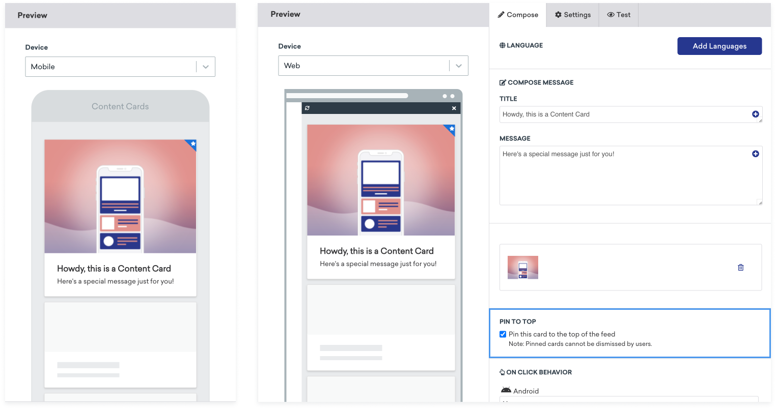
Content Cardsのピンアイコンの構造は以下のとおりです。
<div class="ab-pinned-indicator">
<i class="fa fa-star"></i>
</div>
別のFontAwesomeアイコンを使用したい場合は、i 要素のクラス名を目的のアイコンのクラス名に置き換えます。
アイコンを完全に切り替えたい場合は、i 要素を削除し、カスタムアイコンを ab-pinned-indicator の子として追加します。アイコンを変更する方法はいくつかありますが、簡単な方法の1つは ab-pinned-indicator 要素で replaceChildren() を使用することです。
例:
// Get the parent element
const pinnedIndicator = document.querySelector('.ab-pinned-indicator');
// Create a new custom icon element
const customIcon = document.createElement('span');
customIcon.classList.add('customIcon');
// Replace the existing icon with the custom icon
pinnedIndicator.replaceChildren(customIcon);
カスタムピンアイコンを設定するには、Braze.ContentCards.PinnedIcon スタイルをオーバーライドします。カスタム画像アセットは android:src 要素で宣言する必要があります。例:
<style name="Braze.ContentCards.PinnedIcon">
<item name="android:src">@drawable/{my_custom_image_here}</item>
<item name="android:layout_width">wrap_content</item>
<item name="android:layout_height">wrap_content</item>
<item name="android:layout_alignParentRight">true</item>
<item name="android:layout_alignParentTop">true</item>
<item name="android:contentDescription">@null</item>
<item name="android:importantForAccessibility">no</item>
</style>
デフォルトのピンアイコンを変更するには、ContentCardStyling の pinnedResourceId を設定します。例:
ContentCardStyling(
pinnedResourceId = R.drawable.pushpin,
pinnedImageAlignment = Alignment.TopCenter
)
ContentCardStyling の pinnedComposable でComposableを指定することもできます。pinnedComposable が指定されている場合、pinnedResourceId の値をオーバーライドします。
ContentCardStyling(
pinnedComposable = {
Box(Modifier.fillMaxWidth()) {
Text(
modifier = Modifier
.align(Alignment.Center)
.width(50.dp),
text = "This message is not read. Please read it."
)
}
}
)
cellAttributes インスタンスプロパティの pinIndicatorColor および pinIndicatorImage プロパティを変更して、ピンアイコンをカスタマイズします。例:
var attributes = BrazeContentCardUI.ViewController.Attributes.defaults
attributes.cellAttributes.pinIndicatorColor = .red
attributes.cellAttributes.pinIndicatorImage = UIImage(named: "my-image")
let viewController = BrazeContentCardUI.ViewController.init(braze: braze, attributes: attributes)
サブクラスを使用して、ピンインジケーターを含む BrazeContentCardUI.Cell の独自のカスタムバージョンを作成することもできます。例:
var attributes = BrazeContentCardUI.ViewController.Attributes.defaults
attributes.cells[BrazeContentCardUI.ClassicImageCell.identifier] = CustomClassicImageCell.self
let viewController = BrazeContentCardUI.ViewController(braze: AppDelegate.braze, attributes: attributes)
Objective-Cでは、Attributes によるピンインジケーターのカスタマイズはサポートされていません。
未読インジケーターの色の変更
Content Cardsには、カードが閲覧済みかどうかを示す青い線がカードの下部に表示されます。
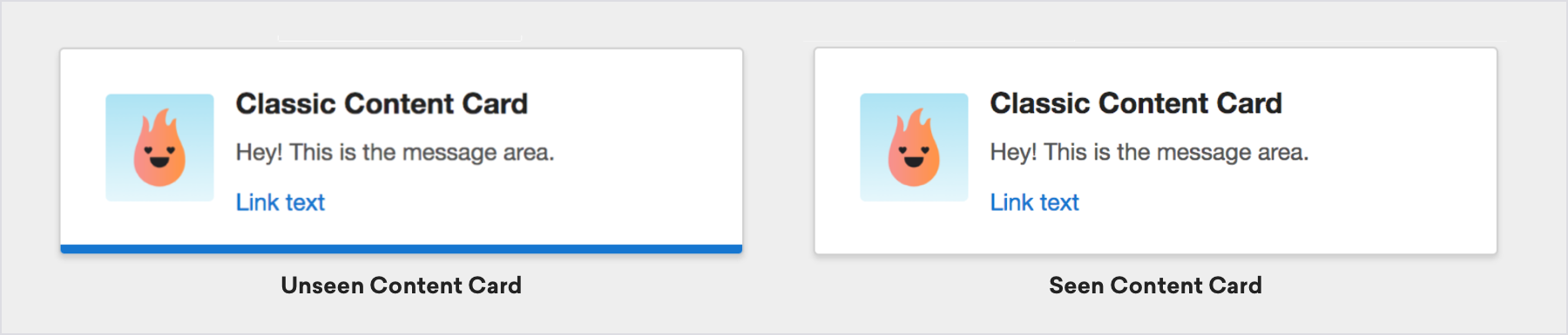
カードの未読インジケーターの色を変更するには、Webページにカスタムcssを追加します。たとえば、未閲覧インジケーターの色を緑に設定するには、以下のようにします。
.ab-unread-indicator { background-color: green; }
colors.xml ファイルの com_braze_content_cards_unread_bar_color の値を変更して、未読インジケーターバーの色を変更します。
<?xml version="1.0" encoding="utf-8"?>
<resources>
<!-- The color used to highlight unread Content Cards at their bottom edge -->
<color name="com_braze_content_cards_unread_bar_color">#1676d0</color>
</resources>
未読インジケーターバーの色を変更するには、ContentCardStyling の unreadIndicatorColor の値を変更します。
ContentCardStyling(
unreadIndicatorColor = Color.Red
)
BrazeContentCardUI.ViewController インスタンスのティントカラーに値を割り当てて、未読インジケーターバーの色を変更します。
let viewController = BrazeContentCardUI.ViewController(braze: AppDelegate.braze)
viewController.view.tintColor = .systemGreen
ただし、未閲覧インジケーターのみを変更したい場合は、BrazeContentCardUI.ViewController.Attributes 構造体の unviewedIndicatorColor プロパティにアクセスできます。Brazeの UITableViewCell 実装を使用する場合は、セルが描画される前にプロパティにアクセスしてください。
たとえば、未閲覧インジケーターの色を赤に設定するには、以下のようにします。
var attributes = BrazeContentCardUI.ViewController.Attributes.defaults
attributes.cellAttributes.unviewedIndicatorColor = .red
let viewController = BrazeContentCardUI.ViewController(braze: AppDelegate.braze, attributes: attributes)
完全な例については、サンプルアプリの例をご覧ください。
BRZContentCardUIViewController のティントカラーに値を割り当てて、未読インジケーターバーの色を変更します。
BRZContentCardUIViewController *viewController = [[BRZContentCardUIViewController alloc] initWithBraze:AppDelegate.braze];
[viewController.view setTintColor:[UIColor systemGreenColor]];
Objective-Cでは、Attributes による未閲覧インジケーターのみのカスタマイズはサポートされていません。
ダークモード
デバイスのダークモードまたはライトモードに基づいて異なる画像やスタイルを表示するには、Content Cardsメッセージでキーと値のペアを使用します。たとえば、dark_mode_image のようなキーと値のペアにダークモード画像アセットのURLを追加します。次に、アプリにカスタムロジックを追加して、デバイスの現在の外観モードを確認し、適切な画像を表示します。
if let darkImageUrl = card.extras["dark_mode_image"],
view.traitCollection.userInterfaceStyle == .dark {
// Use darkImageUrl for the image
}
val darkModeImage = card.extras["dark_mode_image"]
val isDarkMode = (resources.configuration.uiMode and Configuration.UI_MODE_NIGHT_MASK) == Configuration.UI_MODE_NIGHT_YES
if (isDarkMode && darkModeImage != null) {
// Use darkModeImage for the image
}
const darkModeImage = card.extras?.dark_mode_image;
const isDarkMode = window.matchMedia("(prefers-color-scheme: dark)").matches;
if (isDarkMode && darkModeImage) {
// Use darkModeImage for the image
}
このパターンは、テキスト、色、レイアウトなど、外観に依存するあらゆるコンテンツに使用できます。ダークモードの画像アセットをメディアライブラリにアップロードし、キーと値のペアで参照してください。
未読インジケーターの無効化
css に以下のスタイルを追加して、未読インジケーターバーを非表示にします。
.ab-unread-indicator { display: none; }
ContentCardViewHolder の setUnreadBarVisible を false に設定して、未読インジケーターバーを非表示にします。
Jetpack Composeでは、未読インジケーターの無効化はサポートされていません。
Attributes 構造体の attributes.cellAttributes.unviewedIndicatorColor プロパティを .clear に設定して、未読インジケーターバーを非表示にします。
Objective-Cでは、Attributes による未閲覧インジケーターのみのカスタマイズはサポートされていません。